PUBLISHING DESIGN - PROJECT 2

29/04/19 - 20/05/19 (Week 5- Week 8)
Yeap Phay Min (0331073)
Publishing Design
Project 2 - Book
LECTURE NOTES
29/04/19 (Week 5)
Lecture #4 - Typography Redux
For this week, we got a lecture on typography. It was good to recap on the things we've learned in the past semesters. We refreshed back on characters in a typeface, weights in a typeface, legibility and special formatting.
I learned and understood that:
- Legibility is really important when there is a goal of making a body of text more readable.
- Typefaces for the text should be open and well proportioned. A larger x-height is good for reading.
- The underline should actually be lowered so that it does not touch the characters as it can affect the readability.
- The font size determines the line length, which determines the line spacing.
- Leading/line spacing: amount of space between the lines of type.
- If the lines of type are too long it can tire the reader which destroys pleasant reading rhythm.
- Kerning= reduce spacing between letters, letter-spacing= increase spacing between letters, tracking= both
INSTRUCTIONS
29/04/19 (Week 5)
After completing project 1 which is the content generation, we were briefed on the next stage of our book. Back home, we needed to create a type specimen sheet to experiment with the different combinations of type for the heading, body text, pull quote and subtext. We were also required to create 3 grid systems, and select one to experiment with the layout. We should start from the title all the way till the end of chapter 1.
Type Specimen Sheet:
 |
| Fig1.1: Type Specimen Sheet #1 |
 |
| Fig1.2: Type Specimen Sheet #2 |
 |
| Fig1.3: Type Specimen Sheet #3 |
 |
| Fig1.4: Type Specimen Sheet #4 |
The combination of type I decided to use to experiment with the layout was:
Headings: PT Serif Bold / 24pt
Body Text: Avenir Book / 10pt
Pullquote: Avenir Black / 12pt
Subtext: Avenir Light / 8pt
Grids:
Layout References
 |
| Fig2.1: 3 rows x 2 columns |
 |
| Fig2.2: 2 rows x 3 columns |
 |
| Fig2.3: 3 rows x 3 columns |
For the experimental layouts, I decided to go with 3 rows and 3 columns, as I felt that it would allow me to arrange my content better.
 |
| Fig3.1: 1st Experimental Layout #1 |
 |
| Fig3.2: 1st Experimental Layout #2 |
 |
| Fig3.3: 1st Experimental Layout #3 |
 |
| Fig3.4: 1st Experimental Layout #4 |
 |
| Fig3.5: 1st Experimental Layout #5 |
 |
| Fig3.6: 1st Experimental Layout #6 |
 |
| Fig3.7: 1st Experimental Layout #7 |
 |
| Fig3.8: Thumbnails of Layout Attempt 1 |
06/05/19 (Week 6)
In class, we needed to print our layout in spreads for feedback.
 |
| Fig 4.1: Feedback |
 |
| Fig 4.1: Feedback |
Mr Vinod also helped with some arrangement in my layout to improve on it. With the feedback in mind, I continued to work on the layout.
Here's the second attempt at the layouts done in class:
 |
| Fig5.1: 2nd Layout #1 |
 |
| Fig5.2: 2nd Layout #2 |
 |
| Fig5.3: 2nd Layout #3 |
 |
| Fig5.4: 2nd Layout #4 |
 |
| Fig5.5: 2nd Layout #5 |
 |
| Fig5.6: 2nd Layout #6 |
 |
| Fig5.7: 2nd Layout #7 |
 |
| Fig5.8: 2nd Layout #8 |
 |
| Fig5.9: Thumbnails of Layout Attempt 2 |
I got to receive further feedback on the layouts, and I needed to continue to work on it. I decided to remove the background for now and focus on how I want to place everything.
 |
| Fig6.1: 3rd Layout #1 |
 |
| Fig6.2: 3rd Layout #2 |
 |
| Fig6.3: 3rd Layout #3 |
 |
| Fig6.4: 3rd Layout #4 |
 |
| Fig6.5: 3rd Layout #5 |
 |
| Fig6.6: 3rd Layout #6 |
 |
| Fig6.7: 3rd Layout #7 |
 |
| Fig6.8: 3rd Layout #8 |
 |
| Fig6.9: 3rd Layout #9 |
 |
| Fig6.10: 3rd Layout #10 |
 |
| Fig6.11: 3rd Layout #11 |
 |
| Fig6.12: Thumbnails of Layout Attempt 3 (Part 1) |
 |
| Fig6.13: Thumbnails of Layout Attempt 3 (Part 2) |
13/05/19 (Week 7)
In this week's class, I got to receive further feedback on my layout and with the comments received I continued to work on the layouts.
Here is the fourth attempt of the layout, this time until the end of book which is the references.
 |
| Fig7.1: 4th Layout #1 |
 |
| Fig7.2: 4th Layout #2 |
 |
| Fig7.3: 4th Layout #3 |
 |
| Fig7.4: 4th Layout #4 |
 |
| Fig7.5: 4th Layout #5 |
 |
| Fig7.6: 4th Layout #6 |
 |
| Fig7.7: 4th Layout #7 |
 |
| Fig7.8: 4th Layout #8 |
 |
| Fig7.9: 4th Layout #9 |
 |
| Fig7.10: 4th Layout #10 |
 |
| Fig7.11: 4th Layout #11 |
 |
| Fig7.12: 4th Layout #12 |
 |
| Fig7.13: 4th Layout #13 |
 |
| Fig7.14: 4th Layout #14 |
 |
| Fig7.15: 4th Layout #15 |
 |
| Fig7.16: 4th Layout #16 |
 |
| Fig7.17: 4th Layout #17 |
 |
| Fig7.18: Thumbnails of Layout Attempt 4 (Part 1) |
 |
| Fig7.19: Thumbnails of Layout Attempt 4 (Part 2) |
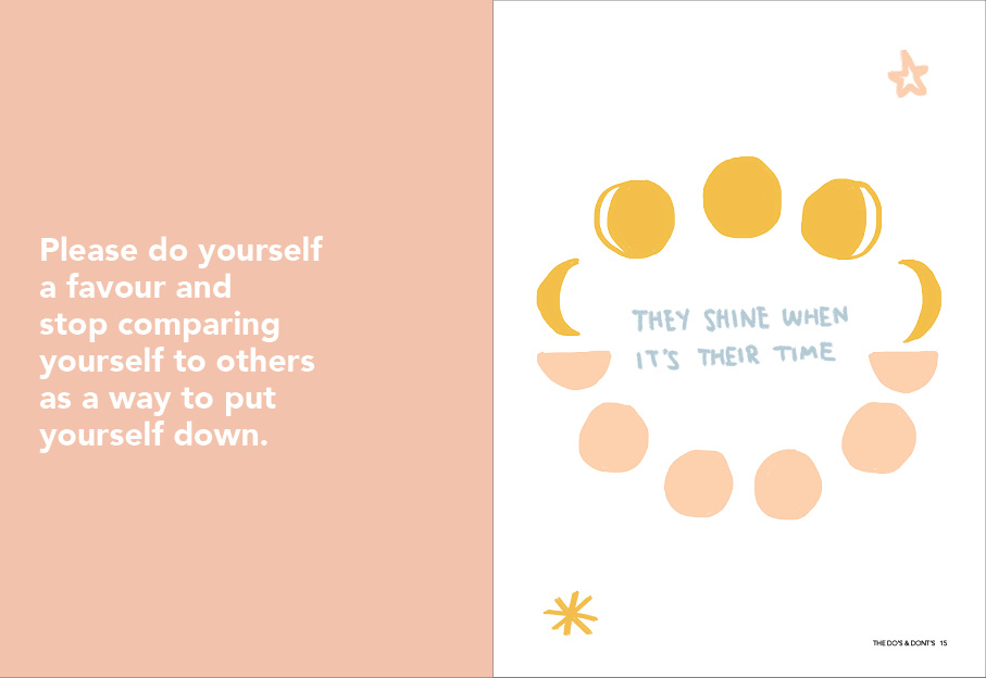
Next, we were required to print our book in black and white and also the actual size we initially chose.
Here are some pictures of the book.
 |
| Fig8.1: B&W Mock-up |
 |
| Fig8.2: B&W Mock-up |
 |
| Fig8.3: B&W Mock-up |
 |
| Fig8.4: B&W Mock-up |
 |
| Fig8.5: B&W Mock-up |
21/05/19 (Week 8)
On Tuesday, I got to show Mr Vinod the black and white mock-up and receive feedback on it. I just needed to make some slight adjustments to my text.
Updated Layout:
 |
| Fig9.1: Updated Layout #1 |
 |
| Fig9.2: Updated Layout #2 |
 |
| Fig9.3: Updated Layout #3 |
 |
| Fig9.4: Updated Layout #4 |
 |
| Fig9.5: Updated Layout #5 |
 |
| Fig9.6: Updated Layout #6 |
 |
| Fig9.7: Updated Layout #7 |
 |
| Fig9.8: Updated Layout #8 |
 |
| Fig9.9: Updated Layout #9 |
 |
| Fig9.10: Updated Layout #10 |
 |
| Fig9.11: Updated Layout #11 |
 |
| Fig9.12: Updated Layout #12 |
 |
| Fig9.13: Updated Layout #13 |
 |
| Fig9.14: Updated Layout #14 |
 |
| Fig9.15: Updated Layout #15 |
 |
| Fig9.16: Updated Layout #16 |
 |
| Fig9.17: Thumbnails of Updated Layout (Part 1) |
 |
| Fig9.18: Thumbnails of Updated Layout (Part 2) |
Moving on from the layouts, I started to explore with the front and back cover of the book.
First Round of Front & Back Cover Exploration:
 |
| Fig10.1: Front & Back Cover Exploration #1 |
 |
| Fig10.2: Front & Back Cover Exploration #2 |
 |
| Fig10.3: Front & Back Cover Exploration #3 |
 |
| Fig10.4: Front & Back Cover Exploration #4 |
 |
| Fig10.5: Front & Back Cover Exploration #5 |
Second Attempt of Front & Back Cover Exploration:
 |
| Fig11.1: Front & Back Cover Exploration #1 |
 |
| Fig11.2: Front & Back Cover Exploration #2 |
 |
| Fig11.3: Front & Back Cover Exploration #3 |
 |
| Fig11.4: Front & Back Cover Exploration #4 |
Final Front & Back Cover:
 |
| Fig11.5: Final Front & Back Cover |
PDF of book in with front and back cover
 |
| Fig11.6: Thumbnails of Layout (Part 1) |
 |
| Fig11.7: Thumbnails of Layout (Part 2) |
Hardcopy of Book:
 |
| Fig 12.1: Staple Binding |
 |
| Fig 12.2 : Staple Binding |
 |
| Fig12.3: Book Cover |
 |
| Fig12.4: Half Title |
 |
| Fig12.5: Full Title |
 |
| Fig12.6: Contents |
 |
| Fig12.7: Introduction |
 |
| Fig12.8: Chapter 1 |
 |
| Fig12.9: Chapter 1 |
 |
| Fig12.10: Chapter 1 |
 |
| Fig12.11: Chapter 1 |
 |
| Fig12.12: Chapter 2 |
 |
| Fig12.13: Chapter 2 |
 |
| Fig12.14: Chapter 2 |
 |
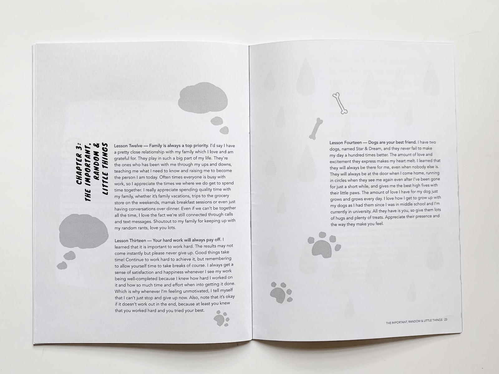
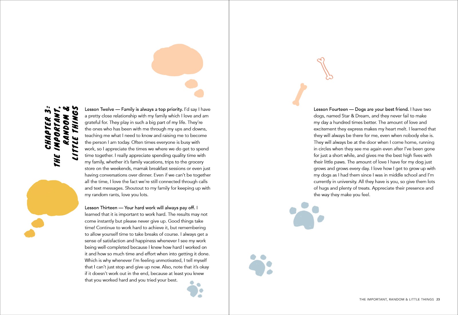
| Fig12.15: Chapter 3 |
 |
| Fig12.16: Chapter 3 |
 |
| Fig12.17: Chapter 3 |
 |
| Fig12.18: Chapter 4 |
 |
| Fig12.19: References |
 |
| Fig12.20: Back Cover |
10/06/19 (Week 11)
This week I got to show Mr Vinod the hardcopy of my book, which I only then I realised that the publisher is missing from the front cover.
Here is the final book (with the front and back cover) after making the changes.
PDF of Print Book
PDF of Print Book
PDF of Final Book
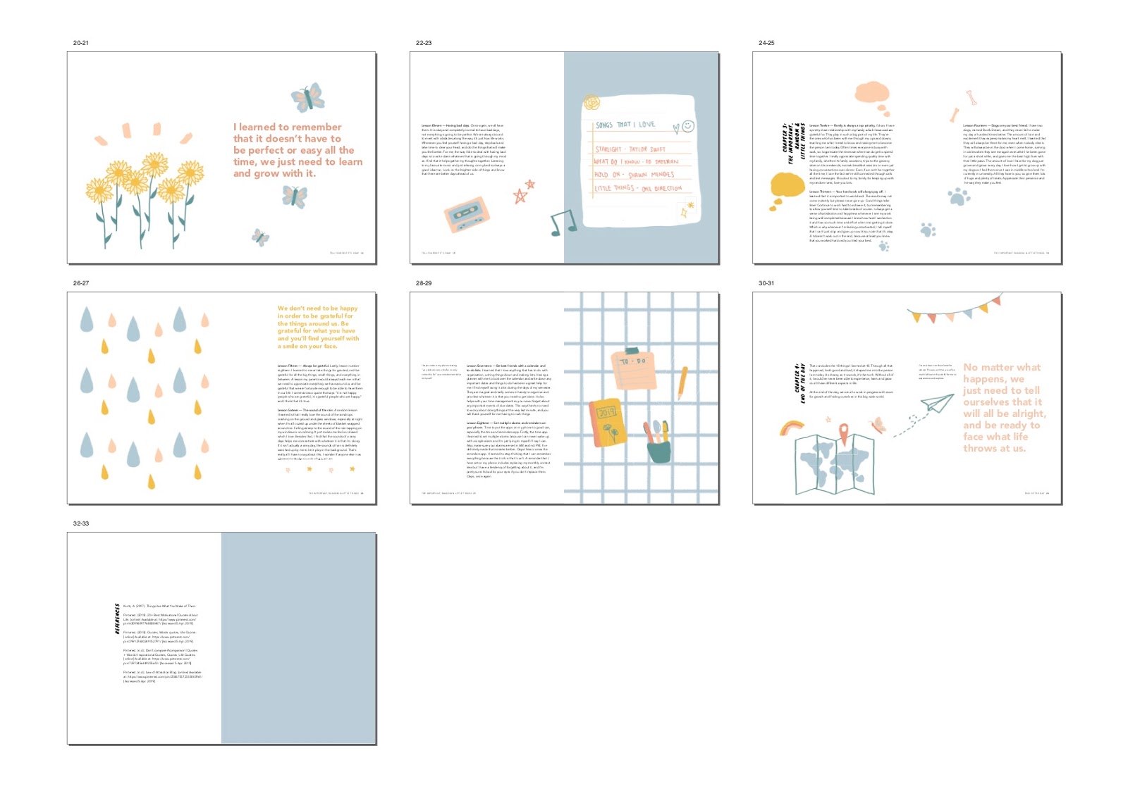
Thumbnails of the final book spreads
 |
| Fig: 13.1: Thumbnails of Final Book (Part 1) |
 |
| Fig: 13.2: Thumbnails of Final Book (Part 2) |
10 Best Spreads:
 |
| Fig: 13.3: Spread 1 |
 |
| Fig: 13.4: Spread 2 |
 |
| Fig: 13.5: Spread 3 |
 |
| Fig: 13.6: Spread 4 |
 |
| Fig: 13.7: Spread 5 |
 |
| Fig: 13.8: Spread 6 |
 |
| Fig: 13.9: Spread 7 |
 |
| Fig: 13.10: Spread 8 |
 |
| Fig: 13.11: Spread 9 |
 |
| Fig: 13.12: Spread 10 |
FEEDBACK
06/05/19 (Week 6)
General feedback: We need to make sure the format is correct, especially the leading and paragraph spacing.
Specific feedback: For project 2, the point size for the text should be smaller as it appears big on the spread. As for the typeface chosen for the heading, it should be more expressive to suit my book. I also need to maintain some consistency of the placement of the text. The body text should be stretched to the bottom of the margin. The leading and paragraph spacing should be adjusted too.
13/05/19 (Week 7)
Specific feedback: I should let my text run to the bottom instead of separating them into smaller chunks as that will result in more pages. The visualisations I’ve done doesn’t need to be paired with the text side by side exactly. For now, the layout for chapter 3 seems to be going well and I should go back to my previous chapters to improve on it.
21/05/19 (Week 8)
Specific feedback: For the black and white book mock-up, the overall layout is okay. I just need to make some minor adjustments to some of the words with kerning and force line break. I could also differentiate between the running head and page number by making one of it bolded. As for the book cover, it is okay that I am still exploring and it will take some to get there. I need to keep in mind that the book cover should be impactful.
24/05/19 (Week 8)
Specific feedback [online]: The back cover has a few good options, but the front cover lacks pointedness and impact.
27/05/19 (Week 9)
Specific feedback: The front cover of the third option is interesting, but I need to make changes to the back cover.
10/06/19 (Week 11)
Specific feedback: Publisher is missing from the cover. I have a widow in my body text which should be avoided and fixed. The composition and layout gets better towards the end.
10/06/19 (Week 11)
Specific feedback: Publisher is missing from the cover. I have a widow in my body text which should be avoided and fixed. The composition and layout gets better towards the end.
REFLECTION
EXPERIENCE
29/04/19 (Week 5)
For this week I got to move on from the visuals and slowly start to work on the layout for the contents of my book.
06/05/19 (Week 6)
This week, I continued to work on the layout for my book, keeping in mind the consistency of the way my elements are placed.
13/05/19 (Week 7)
In class I got to work on the layout again to make it better since it was still a little lost. While working on the layout, I eventually got a better idea of how to place my visuals and text together.
21/05/19 (Week 8)
This week I continued to explore different ways of designing the front and back cover. The initial attempts were quite basic so I also tried some different variations of it.
27/05/19 (Week 9)
For this week I finalised my book cover and got it printed in colour and actual sized. The printing process took a while to get done due to the amount of people in the store but in the end it all worked out.
OBSERVATION
29/04/19 (Week 5)
I observed that the type specimen sheet is really useful as I get to play around with different combinations to see what I liked best. I can see myself using it more often in the future.
06/05/19 (Week 6)
Through this week, I observed that by changing the typeface for my heading to something more expressive rather than a sans serif typeface, the overall layout looks nicer and it suits my book.
13/05/19 (Week 7)
I observed that the layout slowly got better and it looks much better after I received the feedback on it.
21/05/19 (Week 8)
While designing the front and back cove, I observed that it does look better when it is more filled rather than having too much white space.
27/05/19 (Week 9)
I observed that the cover looks better when it actually relates and match with the book and the visuals. As for the printing, I observed that it is important to make sure all visuals are correctly placed as I noticed a small mistake in my spreads and luckily I noticed it before sending it to print.
FINDINGS
29/04/19 (Week 5)
I found that I was a bit lost at placing my text and visuals in the spreads, as I didn't have a clear direction of what I wanted to do.
06/05/19 (Week 6)
While doing the layouts, I found that making use of the grids is really important as it allows the text and other elements to be properly aligned.
13/05/19 (Week 7)
As I was fixing my layout, I found that the layouts were getting better and I needed to go back and improve on the previous chapters.
21/05/19 (Week 8)
Through this I found that with more exploration of the designs, it did start to look better. However I still found myself feeling that it wasn't good/impactful enough.
27/05/19 (Week 9)
Once the hardcopy of the book of produced, I found that I was kinda satisfied with the outcome of the printed book and it was nice to have it in my hands rather than just looking at in on screen.
FURTHER READINGS
06/05/19 (Week 6)
The 5 Rules of Design Composition and Layout by Meg Reid
https://99designs.com/blog/tips/design-composition-and-layout/
In this article that I found, it discusses about the ways we can structure the design of our layouts to make it a good composition.
The Grid
“Grids give order to graphic design. They speed up the design process by helping designers decide where content should be placed rather then were it could be placed.”
This section on grids talks about how grids serves as an organisational guide for us to create designs that are clean, efficient and also easy to adapt too.
This section on grids talks about how grids serves as an organisational guide for us to create designs that are clean, efficient and also easy to adapt too.
Emphasis & Scale
In a design, there should be a point of interest for the viewer’s eyes to rest and hold on to, so that they don’t just take a glance and move on. To create this focal point for hierarchy, scale and emphasis should be applied.
In a design, there should be a point of interest for the viewer’s eyes to rest and hold on to, so that they don’t just take a glance and move on. To create this focal point for hierarchy, scale and emphasis should be applied.
Balance
It is important to keep in mind about the composition and the white space. White space allows our eyes to follow along the design, and it gives elements to the page room to create and be balanced with the positive and negative space.
It is important to keep in mind about the composition and the white space. White space allows our eyes to follow along the design, and it gives elements to the page room to create and be balanced with the positive and negative space.
 |
| Fig 14.1: Good Balance |
 |
| Fig 14.2: Bad Balance |
Rule of Thirds
This is also another fundamental aspect of design as it is a guide that’s simple yet effective. It can help with finding balance in our design.
 |
| Fig 14.3: Rule of Thirds |
Rule of Odds
This rule states that pleasing compositions often includes odd number of elements in the foreground, with 3 being the most common number. The outer elements would then balance the focal point to create sense of balance.
13/05/19 (Week 7)
The Designer’s Guide to Grid Theory by Sam Hampton-Smith
https://www.creativebloq.com/web-design/grid-theory-41411345?fbclid=IwAR3ILtX0AekkWrV4wgbpjtxxzz2uMhkHqpyMP4Ez3Gj9A2DhTwFn5tlSkZk
In the article shared to us by Mr Vinod, it discusses on the topic of grid theory which is useful to know about since we’re currently dealing with grids and layouts for our book. I found this to be informative and decided to use it as this week’s further reading.
Through this I noted that:
Grids establish a meter and rhythm
The purpose of grids is to act as guidelines for the placement the elements in a layout.
 |
| Fig 14.4:Rhythm |
Grids define and reflect proportion
Besides that, grids also help with determining and defining proportion. By using them, it helps with enabling readers to access and understand the content displayed.
Grids work with the Golden Ratio
The Golden Ratio is beneficial when it comes to creating a good layout. It is also simplified as the rule of thirds.
 |
| Fig 14.5: Golden Ratio |
960 grid system on the web
A common size for the web is the 960px grid system due to factors such as having whole numbers that can be divided which gives flexibility to the width of columns.
Grids provide solid foundation
Using grids to determine the position and also achieving balance in a layout provides a foundation to help with ensuring the content is easily understood and also to create hierarchy.
Grids work with design principles
It is important to keep in mind the many basic principles of design to enhance a layout. It is not just about grids only.

Comments
Post a Comment