PUBLISHING DESIGN - PROJECT 1

01/04/19 - 22/04/19 (Week 1 - Week 4)
Yeap Phay Min (0331073)
Publishing Design
Project 1 - Content Generation
LECTURE NOTES
01/04/19 (Week 1)
Briefing
It’s the first day of this module. To start off the class, we were briefed on what we will be working on in this semester, which is a book. Several examples of the work done by seniors were also shown to us to have a better idea of what we will be doing. The module information booklet was shared to us to refer to as well. We were also told to prepare some supplies to bring in the next class for an exercise.
15/04/19 (Week 3)
Lecture #2: History of Print
In this lecture, we got to learn about the history of print which was quite interesting to know about. I never knew that the first printed book is Chinese from the end of the T'ang dynasty, and it was a 16 feet and a foot high scroll. Mr Vinod also took us through the history of print in Korea and Japan, and also about playing cards and Gutenberg & western printing.
At the end of the lecture, we were asked where the world's largest book is located, and it turns out to be located in Mandalay, Myanmar (Burma).
INSTRUCTIONS
01/04/19 (Week 1)
In the first class, we were introduced to our first project, in which we were required to come up with 3000 words to act as the content of the book we'll be designing. In the 3000 words, there should be a minimum of 3 chapters, 3-5 subtexts and 1 caption per chapter. We have one week to complete this.
After some thinking, I decided to write about the 18 things I learned at 18. Within the 18 things, I will divide them into 3 categories. So, the 18 things will be split into 3 chapters. The fourth chapter will just be an ending.
Content
Introduction
Chapter 1: The Dos & Don’ts
Chapter 2: Tell Yourself It’s Okay
Chapter 3: The Important, Random & Little Things
Chapter 4: End of the Day
References
Here is the first attempt of writing the content:
08/04/19 (Week 2)
I got to show Mr Vinod the 3000 words I've written, and received the feedback that I needed to add a subtext and pull quote to the introduction.
Here is the final and updated version of the content:
Later on, he also told us to start thinking about the visuals for our book. It would also be good if we started on some rough attempts of it.
I started by searching up some visual references and complied them in a set of slides.
I also decided to do some further research on the symbolism of some elements I want to include in the visuals, as well as the meanings of each colour in my colour palette.
After the visual references and research, I started with some sketches, followed by rough attempts at illustrating my visuals.
 |
| Fig 1.1: Sketches #1 |
 |
| Fig 1.2: Sketches #2 |
 |
| Fig 1.3: Very Rough Attempts #1 |
 |
| Fig 1.4: Very Rough Attempts #2 |
 |
| Fig 1.5: Very Rough Attempts #3 |
 |
| Fig 1.6: Very Rough Attempts #4 |
 |
| Fig 1.7: Very Rough Attempts #5 |
 |
| Fig 1.8: Very Rough Attempts #6 |
15/04/19 (Week 3)
This week, I continued to work on my visuals, starting with more sketches then illustrating in Photoshop.
 |
| Fig 1.9: Sketches for the 16 Areas |
Then, I moved on to Photoshop to illustrate each element. I also saved each element as png and imported it in Illustrator just so I can see it all together.
 |
| Fig 1.10: Process of illustrating the visuals #1 |
 |
| Fig 1.11: Process of illustrating the visuals #2 |
Here are the elements roughly placed with each other for me to have an idea of how it all looks together.
 |
| Fig 1.12: Initial Visuals #1 |
 |
| Fig 1.13: Initial Visuals #2 |
 |
| Fig 1.14: Initial Visuals #3 |
 |
| Fig 1.15: Initial Visuals #4 |
22/04/19 (Week 4)
I got to show Mr Vinod my progress on my visuals for this week. With the feedback received, I need to further work on my visuals.
Process of illustrating the visuals with Photoshop:
 |
| Fig 2.1: Process of illustrating in Photoshop |
 |
| Fig 2.2: Process of illustrating in Photoshop |
I continued to save each asset in a png format, and import it to Illustrator to see how it looks like together.
Process of arranging the assets in Illustrator:
 |
| Fig 2.3: Process of arranging the assets |
 |
| Fig 2.4: Process of arranging the assets |
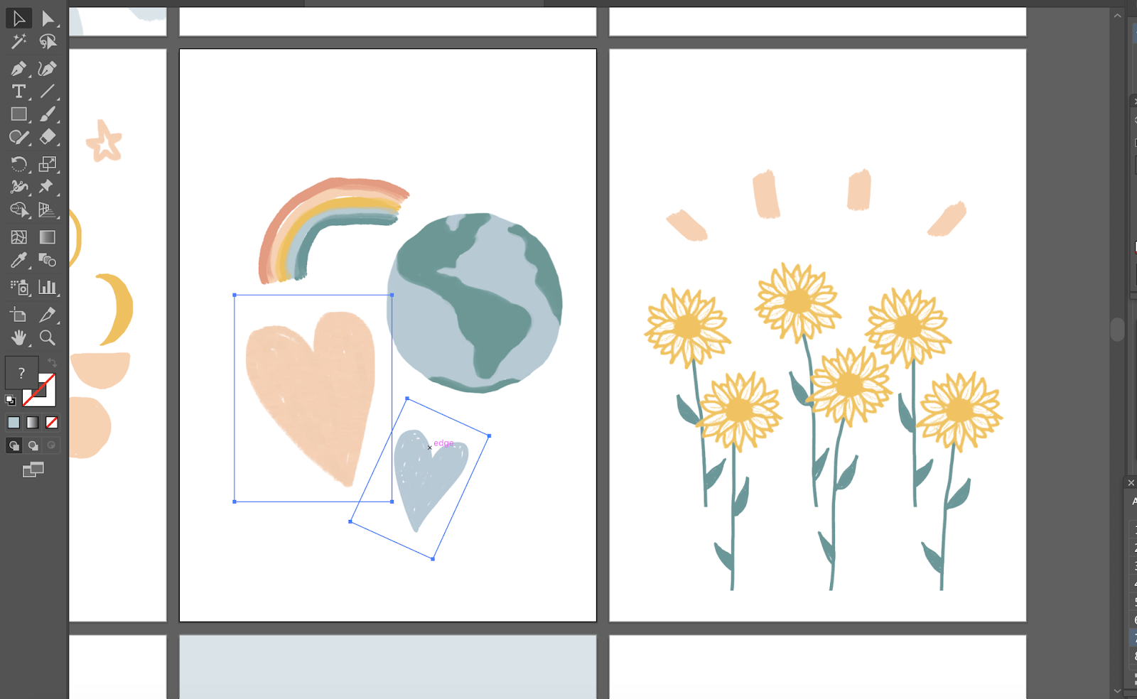
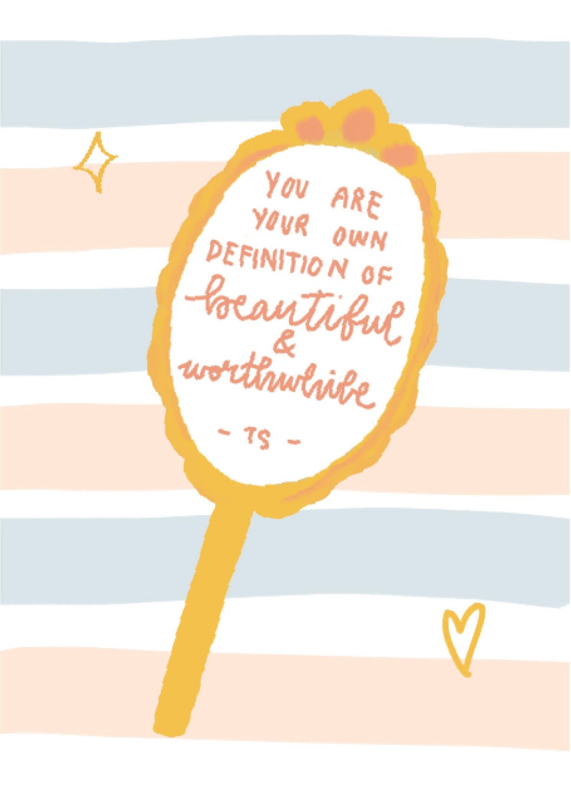
Here is the outcome of the visuals:
 |
| Fig 2.5: Final Visuals 1 |
 |
| Fig 2.6: Final Visuals 2 |
 |
| Fig 2.7: Final Visuals 3 |
 |
| Fig 2.8: Final Visuals 4 |
 |
| Fig 2.9: Final Visuals 5 |
 |
| Fig 2.10: Final Visuals 6 |
 |
| Fig 2.11: Final Visuals 7 |
 |
| Fig 2.12: Final Visuals 8 |
 |
| Fig 2.13: Final Visuals 9 |
 |
| Fig 2.14: Final Visuals 10 |
 |
| Fig 2.15: Final Visuals 11 |
 |
| Fig 2.16: Final Visuals 12 |
 |
| Fig 2.17: Final Visuals 13 |
 |
| Fig 2.18: Final Visuals 14 |
 |
| Fig 2.19: Final Visuals 15 |
 |
| Fig 2.20: Final Visuals 16 |
Thumbnail of the spreads:
 |
| Fig 2.21: Thumbnails |
PDF of Thumbnails
FEEDBACK
01/04/19 (Week 1)
No feedback received as it was just the first week.
08/04/19 (Week 2)
Specific feedback: For this project, I could use a barcode generator to create one instead of using a png, and I should also add a subtext and pull quote to my introduction.
15/04/19 (Week 3)
General feedback: For project 1, continue to work on the visuals and it’ll improve along the way. The visuals also don’t have to be exact to the content written, it can be an abstract form. Also, while taking pictures of our work, zoom in to avoid the work looking distorted.
Specific feedback: I’m clear with the direction of illustration I’m leaning towards. For now I need to consider about the compositional aspects and include elements of surprise.
22/04/19 (Week 4)
Specific feedback: As for project one, some of the visualisations should be heavier by filling it with more elements or creating a background. That way there wouldn’t be a lot of white and empty space.
29/04/19 (Week 5)
General feedback: The blog posts for both exercises and project 1 should be updated before the next class, then we can move on from it and focus on project 2.
Specific feedback: For the visuals, overall it is okay. The only worry is that I mainly use pastel colours, and it may not be as contrasting when it is printed.
REFLECTION
EXPERIENCE
01/04/19 (Week 1)
In the first week, I got to have the experience of writing and formatting the text in a way that I've never done before which was interesting to learn. I also had to write 3000 words which is a lot for me but I managed to get it done in a week so that was good.
08/04/19 (Week 2)
This week, I moved on from the 3000 words and started to think about the visuals I want to include in my book design.
15/04/19 (Week 3)
For this week I continued to work on my visuals. It felt nice to be able to create our own visuals for our book but of course there's times where I felt lost and unsure of what I want to design that will best suit my book.
22/04/19 (Week 4)
I continued to work on my visuals this week with the feedback receives in mind. I really tried to focus on my visuals this week and I really hope it looks well in the end.
OBSERVATION
01/04/19 (Week 1)
From the examples of the senior's works shown to us, I observed how different everyone's work with the different styles and colours. It was nice to have a look at them so we had a better idea of what we will be doing.
08/04/19 (Week 2)
I observed that there were many different styles of mediums I could go with for the visuals, and different styles give off certain moods.
15/04/19 (Week 3)
I observed that I am more drawn to the style of illustration that's like small-ish and simple, which is the direction I chose for my book's visuals.
22/04/19 (Week 4)
By illustrating my visuals, I observed that having a consistent colour palette and style really does help with making everything look well with one another.
FINDINGS
01/04/19 (Week 1)
In the beginning, I found it hard to think of what to write about, because it is a 3000 words content so I needed to come up with something I'm interested to talk about. Once I decided on what to write about, I found that the writing process didn't take long.
08/04/19 (Week 2)
I found that I was really indecisive (as always), and I struggled to figure out which direction of visuals I wanted to lean towards. I knew I wanted to go with illustrations but I wasn't sure on the style of it.
15/04/19 (Week 3)
I found that starting off with really rough sketches were good as it gave me some idea on how I would actually want to illustrate the elements. It's also a chance for me to explore with my visuals.
22/04/19 (Week 4)
While working on my visuals again, I noticed that it does look a lot better when there are heavier visuals with it and not a lot of white empty space to it.
FURTHER READINGS
01/04/19 (Week 1)
Layout Workbook: A real-world guide to building pages in graphic design, by Kristin Cullen
 |
| Fig 3.1: Book Cover |
The Anatomy of Grids
 |
| Fig 3.2: The Anatomy of Grids |
Margins
This defines the active area of the page, directing viewers toward the visual elements. The size of margins can vary depending on the format of the page. Another point to take note of is that if it is a double-page spreads, the inside margins should be larger enough to ensure that nothing gets hidden.
Columns
This describes the vertical divisions of space to align visual elements. To divide the page, single or multiple columns can be used. It is also stated that the general rule is that when there are more columns, it increases flexibility for the arrangement of the elements.
Column Intervals
The spatial divisions between columns. These are smaller in widths and the purpose of this is to prevent collisions of elements by providing inactive negative space.
Flowlines
This divides the page into horizontal divisions, creating additional alignment points to arrange the elements, or make it fall along the edge of the column.
Grid Modules
These are active areas to accommodate the placement of the elements. This can create consistency as the viewer would expect to see information that is similar to be positioned in the same grid modules.
15/04/19 (Week 3)
Exploring Publication Design by Poppy Evans
-Essential Principles and Techniques for Designing Magazines, Brochures & other Print Publications.
 |
| Fig 3.2: Book Cover |
The contents of this book includes the fundamental principles of design that are applied in the specialised field of publication design, award-winning examples of publication design, profiles of successful publication designers and more. The book basically covers a wide variety of effective ways of organising content with the usage of colours and type, visuals, ins and outs of page layout as well as the professional opportunities in publication design.
From this book, I learned that:
- The word publishing is derived from the Latin word "publicus" which means "belonging to the people", hence why publishing means communicating with people.
- The biggest impact on publication design is the invention of personal computers in 1980s, as computerisation has streamlined the production process and gave designers more flexibility with the design.
- Publications exist to inform, persuade, sell or entertain, and it is important to identity the goals and its intended audience.
- The elements of design are visual components in a page/cover layout, while the principles act as rules to help designers determine the relationship between the elements within a layout.
- Basic principles of design: hierarchy, balance, proximity, rhythm, pattern, texture, scale, unity and variety
- Basic elements of design: shape, line, colour, type, imagery
- Colours play an important role in publication as it can set the mood or attitude. Analogous colours and complementary colours are known to work well together.

Print your playing cards with the best manufacturer in Asia
ReplyDeleteCustomized playing cards and game cards WJPC produced have spread to very corner of the world and our WJPC reputation has been recognized by every tier of the industry. We have many standard card sizes and cardstock available which you can customize the face and back of.
This is how easy it is to get yourplaying cardsprinted:
Choose the card size: 57*87mm, 63*88mm or custom.
Select your card stock, number of cards per deck and tell us the finishing: Gloss/Matt lamination or varnish,foil gold/silver, spot UV, embossing etc.
Determine packaging such as tuck box/bottom-lid/magnetic gift or other customized box.
Send us your artwork
Leave the rest of the work to us.
Most Popular card sizes:
Standards: 62*86mm
Bridge: 57*87mm
Poker: 63*88mm
Trumps: 62*100mm
Tarot: 70*120mm
A6: 105*148mm
And many more…
Thank you so much to share such an amazing article with us. I really enjoyed your article. Keep us updating with more informative articles. Also, Check out Custom Game card Printing.
ReplyDeleteSuperb blog to read regarding card and printing.
ReplyDelete