PUBLISHING DESIGN - EXERCISES

01/04/19 - 13/04/19 (Week 1 - Week 7)
Yeap Phay Min (0331073)
Publishing Design
Exercises
LECTURE NOTES
08/04/19 (Week 2)
Lecture #1 - Formats
In our first lecture, we were reminded that our main focus for this module is all about the book format. To start off the lecture, a question was asked to the class on what factors influence and determine the format of a book. The answers included the content (type of content and amount of content), how it is presented, the target audience and its shelf-life.
Through the lecture, we also got to learn about the different formats of book, across different civilisations around the world. These included civilisations from Iran-Iraq, Egypt, India-Pakistan-Afghanistan, China and Europe—Turkey & beyond. It was interesting to look at the images shown in the slides.
22/04/19 (Week 4)
Lecture #3 - Grid
In this week's lecture, we were given a lecture on grids. Through the lecture we learned about margins, gutter and hangline. The margin is what determines how a book will look like. It is basically the structure of the book and plays an important role. The gutter, also commonly known as column intervals, is dependent on the type of alignment. As for the hangline, it is where the text starts from. In summary, the purpose of the grids is to act as a formula to present information.
INSTRUCTIONS
01/04/19 (Week 1)
We were informed to bring supplies such as A3 paper and a blade in the next class as we will be doing some exercises.
Mockup Making
08/09/19 (Week 2)
To start off, Mr Vinod demonstrated to us on how we should lightly create a line/crease on the paper using the back of the blade, to get a nice and crisp folded paper.
Then, our task was to fold an A3 paper in half, and draw lines on the paper to explore 3 different book sizes. It should be bigger than A5 and smaller than A4. Once we drew the lines, we highlighted the one we liked the most.
 |
| Fig 1.1: Size Exploration |
150x220mm
210x210mm
160x210mm
And the size I chose for my book was 160x210mm, which I later on then realised that the height should also be bigger than an A5's height. So, my book later on will be 160x220mm instead.
Once that is done, we created a mock-up book with 32 pages, and 8 spreads. To start, we had to fold a total of 8 A3 papers in half. Then comes the staple binding, in which Mr Vinod demonstrated to us on how it should be done. We needed to make marks on the paper to know where the mid-point, and act as a guide as to where it should be stapled.
 |
| Fig 1.2: Staple Binding - Outside |
 |
| Fig 1.3: Staple Binding - Inside |
Once we had the papers stapled together, we outlined the size of our book on the front cover so we could cut it to size. Once again, Mr Vinod demonstrated to us the way of cutting the book to size. We needed to hold the metal ruler tightly, while using a blade lightly to go over it several times until it is cut all the way through.
 |
| Fig 1.4: Completed mock-up of book |
Van De Graaff Grid
15/04/19 (Week 3)
The first exercise we did for this class was the van de graaf grid. We used an A4 paper, folded into half, and drew the necessary lines on it.
Here is the outcome of the grid.
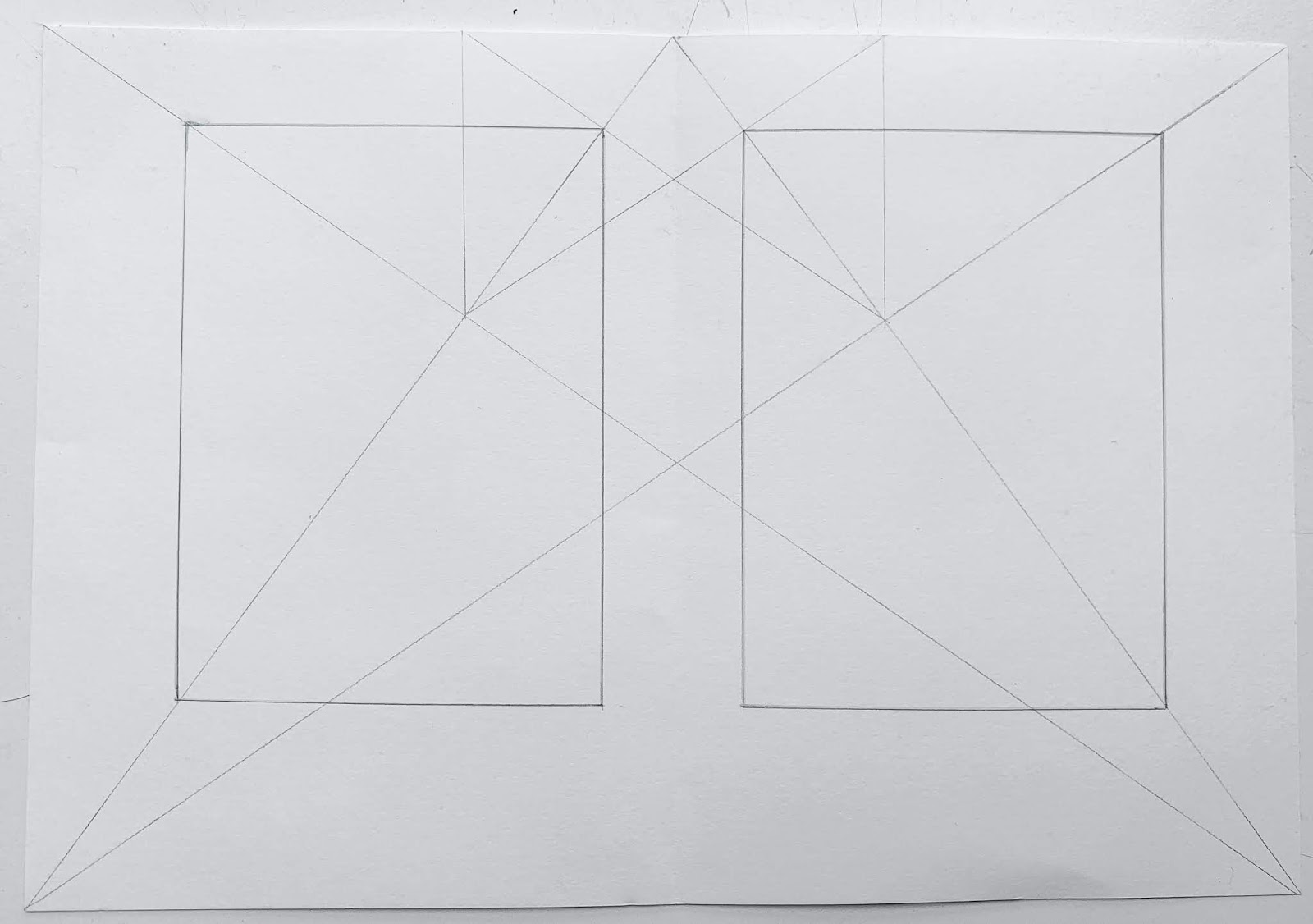 |
| Fig 2.1: Van De Graff Grid |
After we that, we opened up Adobe InDesign and created the grids in there.
 |
| Fig 2.2: Process |
 |
| Fig 2.3: Outcome |
Signature Folding System
15/03/19 (Week 3)
Moving on from that exercise, we were required to take another A3 paper and fold it 3 times. Then, write the numbers on all the 16 pages.
1 signature = 16 pages
 |
| Fig 3.1: Outcome after 3 folds |
 |
| Fig 3.2: Top View |
 |
| Fig 3.3: Numbering the pages |
 |
| Fig 3.4: Front |
 |
| Fig 3.5: Back |
Grids
22/04/19 (Week 4)
For this exercise, we needed to print out 5 spreads of a layout, and draw lines on it to determine the margins. We also exchanged some spreads with others so we have more variety.
Here are the 5 spreads I chose from the book A Work in Progress by Connor Franta.
 |
| Fig 4.1: Selected spread #1 |
 |
| Fig 4.2: Selected spread #2 |
 |
| Fig 4.3: Selected spread #3 |
 |
| Fig 4.4: Selected spread #4 |
 |
| Fig 4.5: Selected spread #5 |
Pictures of the exercise:
 |
| Fig 4.6: #1 |
 |
| Fig 4.7: #2 |
 |
| Fig 4.8: #3 |
 |
| Fig 4.9: #4 |
 |
| Fig 4.10: #5 |
Form & Movement - 1 Colour
22/04/19 (Week 4)
For the next exercise, we needed to use InDesign. The exercise is all about exploring simple shapes to create a pattern based on the grid system.
To start, we needed to set the margins and columns.
 |
| Fig 5.1: Setting up the margins |
 |
| Fig 5.2: Process of arranging the shape |
 |
| Fig 5.3: Process of arranging the shape |
Thumbnail of the spreads:
Outcome of the gif:
 |
| Fig 5.4: Gif |
Form & Movement - 2 Colours
29/04/19 (Week 5)
This week, we did an exercise similar to the previous week, but this time we were required to introduce a secondary colour to it. We should also use a different grid system and different shapes from last week's.
As usual, we started with setting up the margins, rows and columns. Then, I started playing around with the placement of the shape and also the colours.
 |
| Fig 6.1: Grids |
 |
| Fig 6.2: Process |
 |
| Fig 6.3: Process |
 |
| Fig 6.4: Process |
Thumbnail of the spreads:
Outcome of the gif:
 |
| Fig 6.5: Gif |
FEEDBACK
08/04/19 (Week 2)
General feedback: Before stapling the paper, make sure the pages are aligned, and while cutting the paper we should put more pressure on the ruler and less pressure on the blade.
Specific feedback: For the exercise, the size of the paper should be bigger than A5 on both the height and width. I made the mistake of only making the width bigger.
22/04/19 (Week 4)
Specific feedback: For the exercise, I should make use of the grids while arranging the shapes to make sure it is properly aligned.
29/04/19 (Week 5)
Specific feedback: I could also add secondary colours for the background as well, not just the elements.
29/04/19 (Week 5)
Specific feedback: I could also add secondary colours for the background as well, not just the elements.
REFLECTION
EXPERIENCE
08/04/19 (Week 2)
In this class, I got to explore different book sizes as well as create a mock-up for it which was pretty fun to me.
15/04/19 (Week 3)
We got to do two exercises this week which was the grids and the folding system. It was interesting to learn about.
22/04/19 (Week 4)
This week, we did two exercises which is about grids and movement. In the exercises I got to learn about things such as the margins, gutter and hangline of a book, and also create movement with simple shapes.
29/04/19 (Week 5)
For this week's exercise, we got to do something similar as last week's but this time a secondary colour is introduced.
OBSERVATION
08/04/19 (Week 2)
I observed how satisfying it was to look at the book being cut to size as the papers are so evenly and tidily cut through. *inserts heart eyes emoji*
15/04/19 (Week 3)
Through the exercises, I observed that the grids and the signature folding system are useful to know about.
22/04/19 (Week 4)
While doing the movement exercise, I observed that by using the grids it really does help in making things aligned.
29/04/19 (Week 5)
Through this week's exercise, I observed that by adding a secondary colour to the elements and the background, it made it more interesting.
FINDINGS
08/04/19 (Week 2)
I found this week's exercise to be fun, even though it was just a simple mock-up. It was nice to learn how to fold a paper nicely, use a stapler gun, as well as cutting the book to size.
15/04/19 (Week 3)
While doing the van de graaff grid, I found that my lines were not precise in the beginning which annoyed me so I had to erase and draw the lines.
22/04/19 (Week 4)
I found that I struggled with the second exercise we did of the movement with simple shapes as I was unsure of how I should arrange the shapes from one spread to another to create the sense of movement.
29/04/19 (Week 5)
I found that I didn't struggle as much with the exercise as I did last week. I had a clearer idea of what we needed to do and how movement can be created with the shapes.
FURTHER READINGS
08/04/19 (Week 2)
Design and Layout: Understanding and Using Graphics by David Dabner
 |
| Fig 7.1: Book Cover |
 |
| Fig 7.2: Text + Image |
 |
| Fig 7.3: Text + Image |
 |
| Fig 7.4: Layout |
 |
| Fig 7.5: Layout |
22/04/19 (Week 4)
Basic Brochures by Page One
 |
| Fig 7.6: Book Cover |
This book showcases various brochure designs, and I decided to pick this book up to look at the layouts and design of it. The brochures are categorised into no fold, single fold and multiple folds. It was interesting to flip through this book and look at the various designs of it, and how the visuals are placed along with the text. I also noticed that there is always some sort of consistency between the pages. The visuals such as the images and colours also suits the content which is good.
Here are some of designs from the book.
 |
| Fig 7.7: Example #1 |
 |
| Fig 7.8: Example #2 |
 |
| Fig 7.9: Example #3 |
 |
| Fig 7.10: Example #4 |
29/04/19 (Week 5)
Magazine Spreads - Good and Bad Practices by Nikola
http://www.magazinedesigning.com/magazine-spreads-good-bad-practices/
In the contents of this article, it states by stating that magazine spread is two pages that are next to each other, and each spread works as one unit. Viewers will look at a spread as one unit, so it is important to keep in mind that while you are designing you should look at a spread as a single element, even if the content is different.
From the article, I learned that:
- The area of a spread that is most visible is the outer upper parts of a page. Because, if readers were to just flip the pages, the outer upper part will be more exposed to the viewer.
- The headline shouldn't be placed at the bottom of the page because it is not a natural starting point. The readers shouldn't have to search through the page to find what's important.
- Headline > Introduction > Main copy
- Big blocks of text should not be broken up for the sake of just throwing them around the page. The flow of the text columns should be tidy and even.
Some examples shown in the articles:
 |
| Fig7.11 : Bad placement of the headline |
 |
| Fig7.12 : Acceptable placement of the headline |
 |
| Fig7.13 : Bad text flow |
 |
| Fig7.14 : Good text flow |

Comments
Post a Comment