27/08/18 - 10/09/18 (Week 1 - Week 3)
Yeap Phay Min (0331073)
Advanced Typography
Exercises
_______________________________________________________________
LECTURE NOTES
27/08/18 (Week 1)
On the first day of class, Mr Vinod brief us through the module information booklet for us to have an idea to what we will be learning and doing in this class. He also mentioned that for a change, we will be doing the lectures by presenting a topic in groups. For our first lecture, the topic was typographic systems, and since there were 8 systems we were divided into 8 groups and told to come up with a short presentation on one of the systems assigned to each group. Later that day, Mr Vinod told us to use the information presented by every group to come up with a set of presentation slides of our own, containing all the 8 systems.
From the lecture, I got to learn and understand about the different typographic systems which includes axial, radial, dilatational, random, grid, modular, transitional and bilateral. Each system has their own characteristics, and I learned that in a design, multiple systems can be combined and used. It isn't necessary to strictly stick to just one typographic system. However for the specific exercise we're doing we should stick to the individual system so we can clearly learn about how each system works.
Here are my slides on the 8 typographic systems.
_______________________________________________________________
INSTRUCTIONS
Typographic Systems
27/08/18 (Week 1)
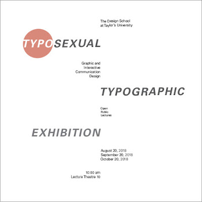
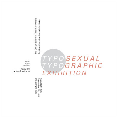
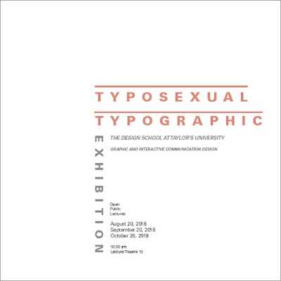
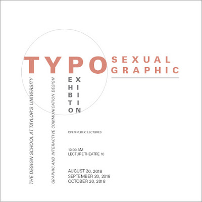
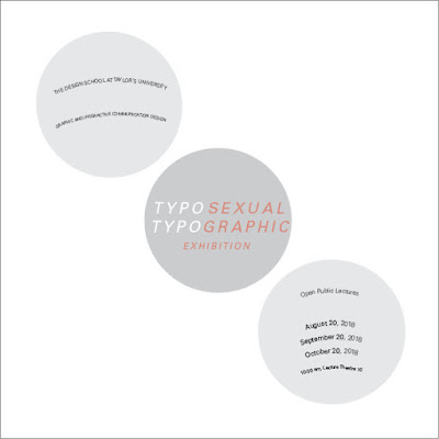
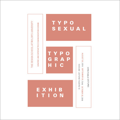
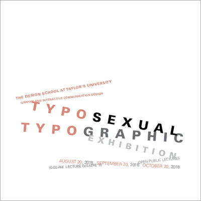
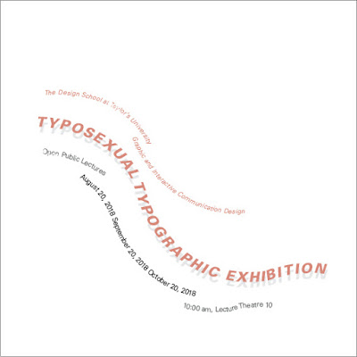
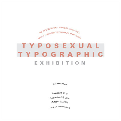
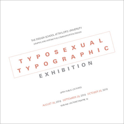
For the first exercise, we were told to use our understandings of all the systems from the lecture and come up with 2 designs for each of the 8 systems (a total of 16 designs). In our design, we needed to include a set of information given from the MIB as well as using any of the 10 type families given to us previously.
Information to be included:
The Design School at Taylor’s University
Graphic and Interactive Communication Design
Typosexual Typographic Exhibition
Open Public Lectures
August 20, 2018
September 20, 2018
October 20, 2018
10:00 am, Lecture Theatre 10
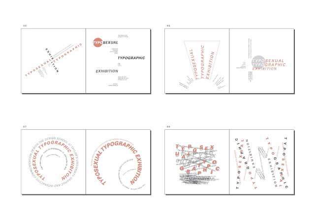
Here are my final compositions.
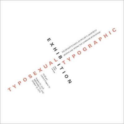 |
| Fig2.17: (Final Composition) Axial |
 |
| Fig2.18: (Final Composition) Axial |
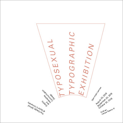 |
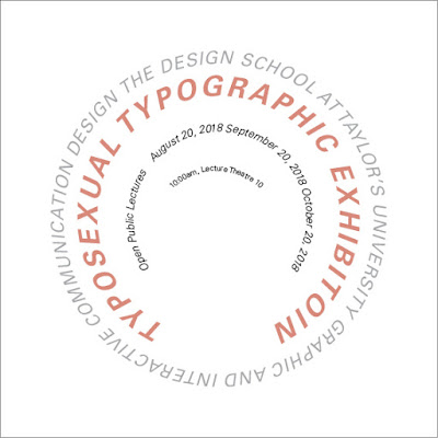
| Fig2.19: (Final Composition) Radial |
 |
| Fig2.20: (Final Composition) Radial |
 |
| Fig2.21: (Final Composition) Dilatational |
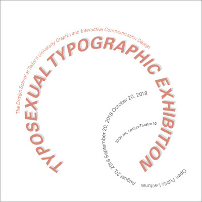 |
| Fig2.22: (Final Composition) Dilatational |
 |
| Fig2.23: (Final Composition) Random |
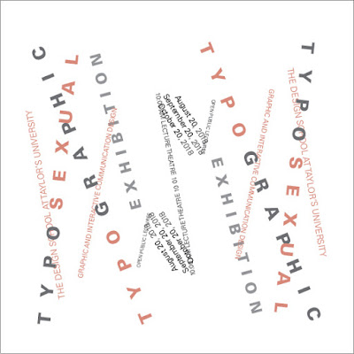 |
| Fig2.24: (Final Composition) Random |
 |
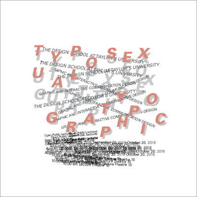
| Fig2.25: (Final Composition) Grid |
 |
| Fig2.26: (Final Composition) Grid |
 |
| Fig2.27: (Final Composition) Modular |
 |
| Fig2.28: (Final Composition) Modular |
 |
| Fig2.29: (Final Composition) Transitional |
 |
| Fig2.30: (Final Composition) Transitional |
 |
| Fig2.31: (Final Composition) Bilateral |
 |
| Fig2.32: (Final Composition) Bilateral |
 |
| Fig2.33: Thumbnails of Final Composition #1 |
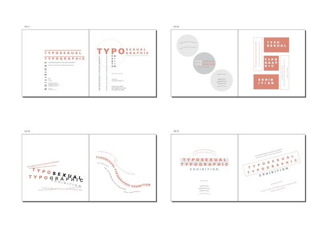 |
Fig2.34: Thumbnails of Final Composition #2
|
Embedded PDF of Final Compositions (Pages)
Embedded PDF of Final Compositions (Spreads)
10/09/18 (Week 3)
Type & Play - Part 1: Finding Type
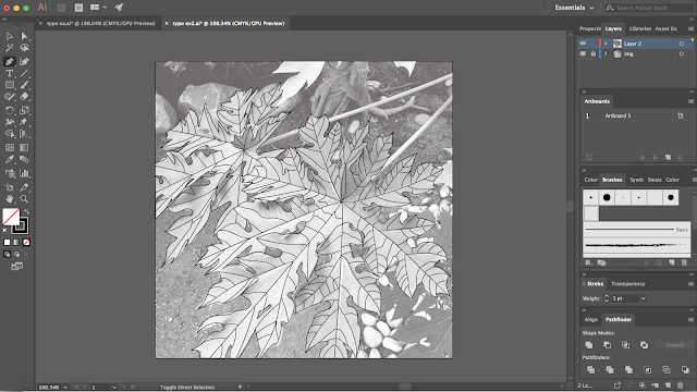
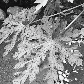
In the first part of the second exercise, we are required to make a selection of an image between either man-made objects, structures or even nature. Using the image, import it to Adobe Illustrator and trace over the lines seen. With the lines drawn, find shapes and identify 5 potential letterforms within the image. Colour is not allowed, and the size should be a square of 200x200mm.
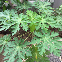 |
| Fig3.1: Image of papaya leaves taken from my garden |
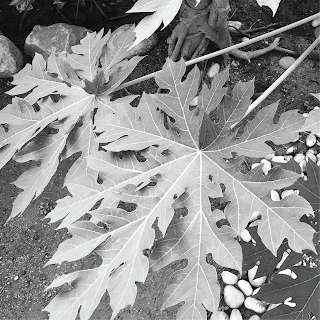 |
| Fig3.2: Cropped image of what I want to trace over (final image used) |
 |
| Fig3.3: Process of tracing the lines seen (outline of papaya leaves and the veins) |
 |
| Fig3.4: Image + Tracing |
 |
| Fig3.5: Final Outcome of the Tracing |
Once I was done with the tracing, I started to dissect and identify potential letterforms with the image that I just traced over. I also created new layers and artboards for each letters to be more organised.
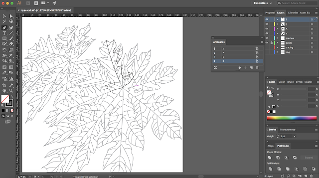 |
| Fig3.6: Process of finding letters |
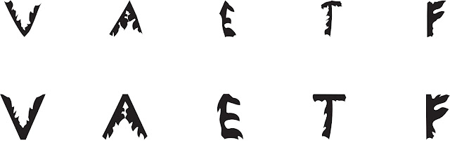
After spending some time on searching, I managed to find 5 letters from the image.
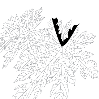 |
| Fig3.7: Letter "V" |
 |
| Fig3.8: Letter "V" |
 |
| Fig3.9: Letter "A" |
 |
| Fig3.10: Letter "A" |
 |
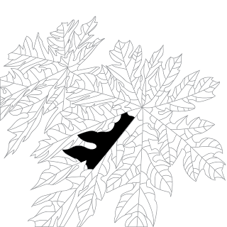
| Fig3.11: Letter "E" |
 |
| Fig3.12: Letter "E" |
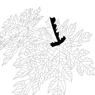 |
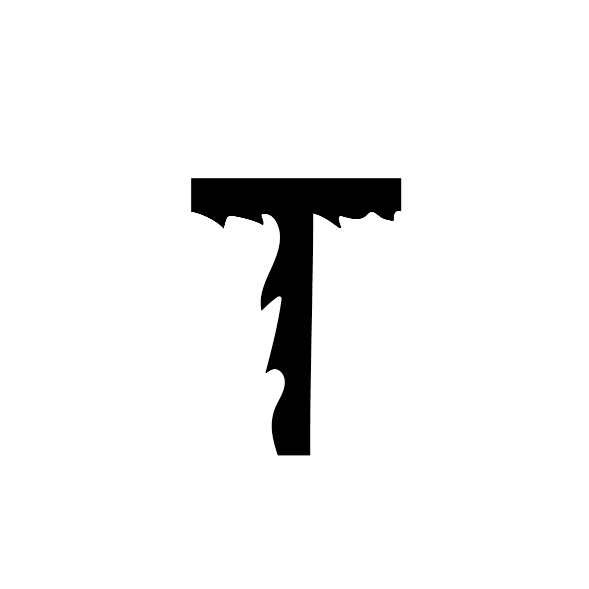
| Fig3.13: Letter "T" |
 |
| Fig3.14: Letter "T" |
 |
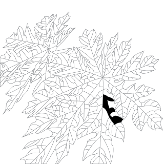
| Fig3.15: Letter "F" |
 |
| Fig3.16: Letter "F" |
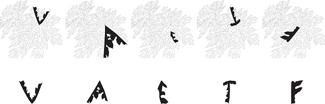 |
| Fig3.17: Overview of all the 5 letters |
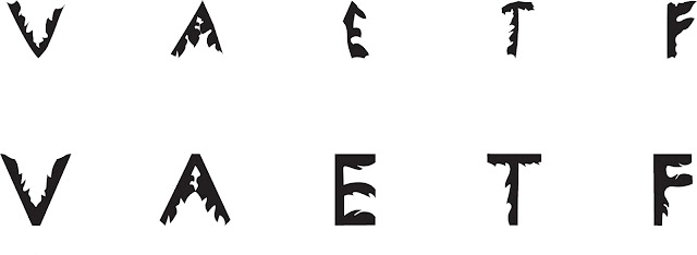
Since we did not have class due to public holiday, I sent my work to Mr Vinod through Facebook message. With the feedback received, he mentioned that what I've done is interesting and well explored. However, I needed to continue working on this as I had only completed the first stage/iteration of the process. After I had extracted the letters, I need to
revise the letters to make it more refined. (The shape does not need to be exactly within its origin)
 |
| Fig3.18: Refining the letters using grids as a guidelines |
 |
| Fig3.19: Refined Letter "V"- Initial Attempt |
 |
| Fig3.20: Refined Letter "A"- Initial Attempt |
 |
| Fig3.21: Refined Letter "E"- Initial Attempt |
 |
| Fig3.22: Refined Letter "T"- Initial Attempt |
 |
| Fig3.23: Refined Letter "F" - Initial Attempt |
 |
| Fig3.24: Before (Top) & After (Bottom) - Initial Attempt |
Mr Vinod got to look at the first part of my exercise again and gave me feedback about it. With the feedback given, I will need to make more adjustments to the letters for it to be more refined, especially the letters E, T and F.
 |
| Fig3.25: Refined Letter "V" - 2nd Attempt |
 |
| Fig3.26: Refined Letter "A"- 2nd Attempt |
 |
| Fig3.27: Refined Letter "E"- 2nd Attempt |
 |
| Fig3.28: Refined Letter "T"- 2nd Attempt |
 |
| Fig3.29: Refined Letter "F"- 2nd Attempt |
 |
| Fig3.30: Before (Top) and After (Bottom) - 2nd Attempt |
Mr Vinod mentioned that the refining process is much better and the letters were overall good. However I could still make some adjustments to them such as making the tips of "V" and "A" flat.
 |
| Fig3.31: Refined Letter "V" - Final |
 |
| Fig3.32: Refined Letter "A" - Final |
 |
| Fig3.33: Refined Letter "E" - Final |
 |
| Fig3.34: Refined Letter "T" - Final |
 |
| Fig3.35: Refined Letter "F" - Final |
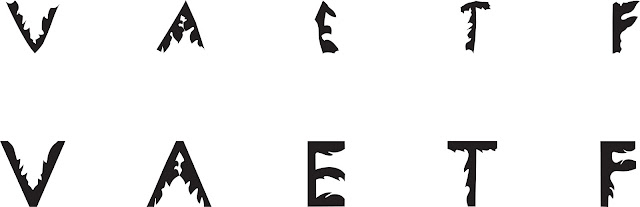 |
Fig3.36: Before (Top) and After (Bottom) - Final |
PDF of Final Letters
17/09/18 (Week 4)
Type & Play - Part 2
For the next part, we needed to make a selection of an image of our own between either man-made objects, structures or nature, which will then be combined with 20-30 words. As usual, we will be using any 1 of the 10 type families given to us previously. One colour is allowed for this part of the exercise, and the size should be A4.
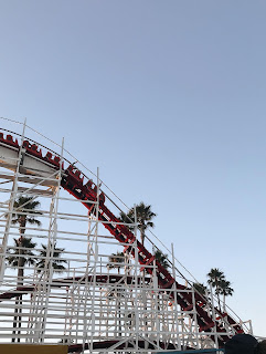
I decided to go through my gallery to select photographs of structures that I liked and found interesting. Then, I imported the photos on Photoshop to desaturate it and use the duotone feature to add a single colour. I was unsure of what I wanted to do with my composition, so I tried out 3 different designs.
Here are my initial attempts at this exercise.
 |
| Fig4.1: Original Picture #1 |
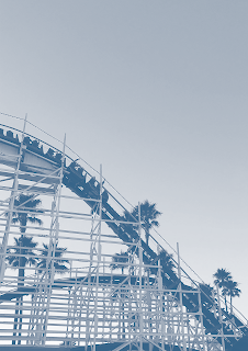 |
Fig4.2: Edited Picture #1
|
 |
| Fig4.3: Composition #1 |
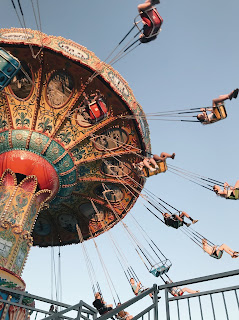 |
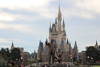
| Fig4.4: Original Picture #2 |
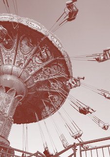 |
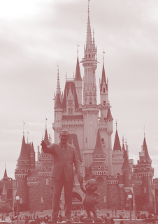
| Fig4.5: Edited Picture #2 |
 |
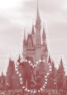
| Fig4.6: Composition #2 |
 |
| Fig4.7: Original Picture #3 |
 |
| Fig4.8: Edited Picture #3 |
 |
| Fig4.9: Composition #3 |
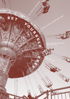
Mr Vinod mentioned that the second part of the exercise was a good attempt, and that the rollercoaster composition gives me the best option to express textually. Therefore, I will further develop on this exercise with the feedback given.
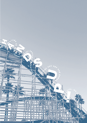 |
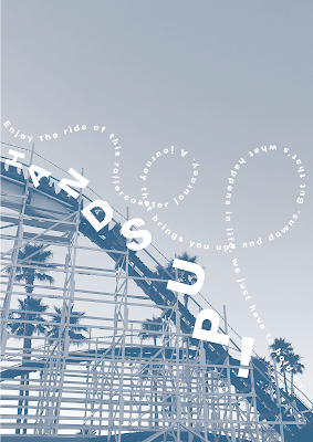
| Fig4.10: Second Attempt #1 |
 |
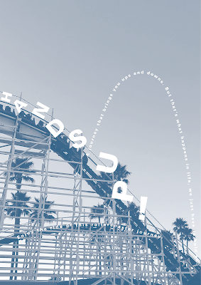
| Fig4.11: Second Attempt #2 |
 |
| Fig4.12: Second Attempt #3 |
 |
| Fig4.13: Second Attempt #4 |
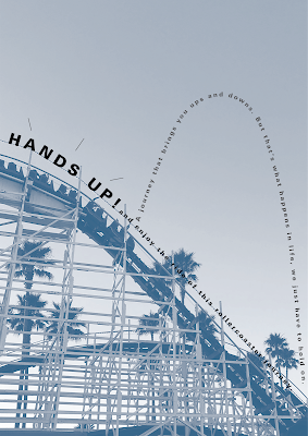
For this part of the exercise, Mr Vinod mentioned that my second attempts had improvements, but I could make it better. He showed me several examples of compositions that has a good use of space and the words give off movement/power.
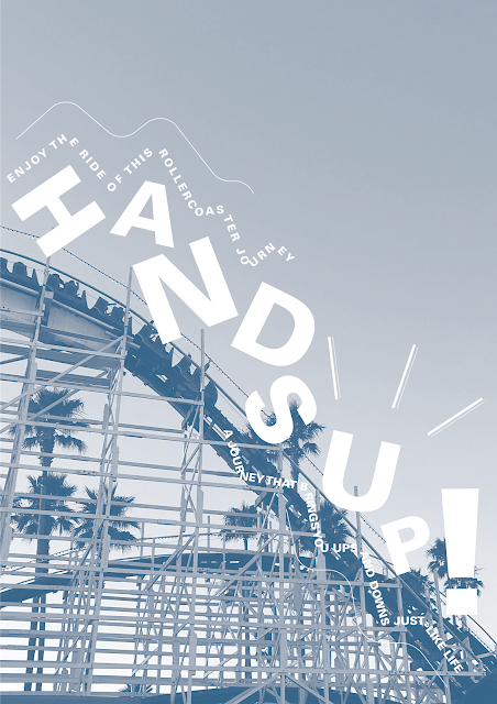 |
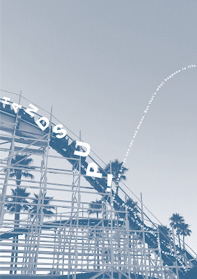
| Fig4.14: Final Composition |
_______________________________________________________________
FEEDBACK
03/09/18 (Week 2)
General feedback: Mr Vinod mentioned that it is important to apply the typographic systems to our compositions correctly, without forgetting about the importance of having a good composition, which includes hierarchy and good communication. Other principles such as alignment and balance of a composition are important aspects as well. As for colours, we need to be careful with it and not get too carried away. Using black as a background colour to “fill up the space” is not a good idea, so as having a design with a 45 degree angle. He also mentioned that a good design should leave room for imagination.
Specific feedback: My compositions are generally acceptable, with some being too diagonal because of the 45 degree rotation, as well as some that did not showcase the typographic system effectively. Out of all the designs, he mentioned that the composition that portrayed random was the nicest.
10/09/18 (Week 3)
Specific feedback: Good job on the reworked Exercise 1: Typo’ Systems. Good job on the documentation in your e-portfolio. The Exercise part 1 (Finding Type) was interesting and well explored at the initial stages. The output of the letters thus far are a crude and faithful representation of its origins. I in particular, I see great potential with the letter A. I think the other letters can be derived similarly. This would be considered the first stage or iteration of your process. You are to now revise the letters to make it more refined (think practical). Use the characters ... once you start the revision they don’t need to be faithful to their origin. Meaning the shape does not need to be exactly as per its origin. This is what I mean, when I say, evolve or refine.
17/09/18 (Week 4)
Specific feedback: Part 1. You didn’t do to E, T & F the same as you did to V & A. It’s a pity because I think you have something good here but you are not continually going through the refining cycle with them. It’s a process... Part 2. Good attempt at trying to integrate the type with the visual. Roller coaster integration could be a little more extreme and louder. The text is rather subdued here. The 2nd option of the revolving ride was good but the text seem overwhelmed by the image. The Disney image has a much more enthusiastic text and is better than the other 3 in terms of expression. However I think the roller coaster actually gives you the best option to express textually.
Good effort! Good time management.
24/09/18 (Week 5)
General feedback: For part 1 of the exercise, we should dissect the lines seen in the picture, have a baseline and refine the letters while retaining character. For part 2, we all need to work on it for our composition to be more exciting.
Specific feedback: For part 1 of the exercise, Mr Vinod mentioned that I did a good job at refining the letters, and I could still make minor adjustments to it. As for part 2, I had improvements to my compositions but I should give it another try. I should utilise the space and imagine more. The composition should also give off some sort of movement and power.
_______________________________________________________________
REFLECTION
EXPERIENCE
27/08/18 (Week 1)
This week we got to team up and present a part of a lecture to the class which we've never done before in the first semester's typography class. Besides being able to learn about the different typographic systems, I got to try out how these systems are applied to a composition which is interesting.
03/09/18 (Week 2)
In today's class, we got together around the table for a feedback session and I got to have a look at my classmates's compositions and listen to their feedbacks, which was general feedback that was really useful for me so I knew what I should and should not do in my designs.
10/09/18 (Week 3)
This week's class was on a public holiday so we got to work from home. For the first part of the exercise, I got to trace over the lines of an image and dissect potential letterforms from it which was something new to me yet interesting.
17/09/18 (Week 4)
It's another public holiday so we got to work from home again. In the second part of the exercise, I got to create a composition by combining text of 20-30 words together with a picture.
OBSERVATION
27/08/18 (Week 1)
I observed that in each system, there are many possibilities of how it can be applied to a composition and the different things that can be done to create hierarchy as well as emphasis.
03/09/18 (Week 2)
I observed that everyone has different ideas and ways to create compositions for the systems and a lot of them were exciting and well executed. I also observed that what we see on the screen compared to when it's printed is different, as when I used a grey shade in my composition, it turned out to be really light and almost not visible.
10/09/18 (Week 3)
From this exercise, I observed how interesting it was that letters could be extracted and created just from a single image with lines traced over it.
17/09/18 (Week 4)
While creating the compositions, I observed that the placement of the text is important as it is what helps express it.
FINDINGS
27/08/18 (Week 1)
I realised that I've came across compositions that apply the typographic systems back in the first semester, I just didn't know about the systems back then. While coming up with the compositions, I found myself to be stuck at times and unsure of where I should place certain information.
03/09/18 (Week 2)
I realised that I misunderstood some of the systems and did not apply them in my compositions correctly. I also found out from Mr Vinod that it isn't just about applying the systems correctly, it is also about creating a good design with effective communication, hierarchy and other principles.
10/09/18 (Week 3)
While doing this exercise, I found that the letters I dissected from the traced image somewhat reflects back to it's origin. Since I used an image of papaya leaves, the shape of letters I extracted had some characteristics of the leaves.
17/09/18 (Week 4)
At the start, I found myself to be a little lost as I had no idea what text I wanted to use that will best suit the image I chose, and where should the text be placed.
_______________________________________________________________
FURTHER READING
27/08/18 (Week 1)
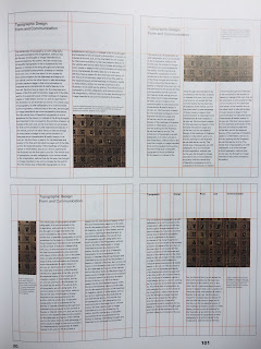
Typographic Design: Form and Communication by Rob Carter, Ben Day and Philip Meggs
 |
| Fig 5.1: Book Cover |
While browsing through the contents of this book, I was drawn to the chapters called "Visual Hierarchy" and "The Typographic Grid" since our first lecture was about typographic systems, and I felt that it will be useful to know these things for the first exercise.
Visual hierarchy refers to the arrangement of elements in a graduated series following the level of importance within an area of typographic space. Contrasts used to create hierarchical arrangements can be achieved through size, weight, colour and spatial interval.
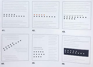 |
| Fig5.2: Examples of how visual hierarchy is achieved |
A grid is said to be like a skeletal framework that is used by designers to help them organise text within a given field. Grid systems are capable of providing form and space with harmony and aesthetic when it is being used effectively. This is also a great system to use when it comes to the clarity of information delivered.
Single column grids: Text found in traditional novel or exhibition panel are often set as a single block. It is important to take the margins of the page into consideration as well. Within the page, the block of text can be sized and adjusted to achieve a variety of proportional relationships.
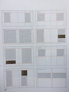 |
| Fig5.3: Examples of single column grids |
Multi-column grids: This grid is based on a system of intersecting and perpendicular axes with rectangular units defined by network of horizontal and vertical lines. While working with these grids, it is important to to balance the type size, line length and leading. Rhythm can also be achieved by repetition and contrast of columns and non-objective elements.
 |
| Fig5.4: Examples of multi-column grids |
03/09/18 (Week 2)
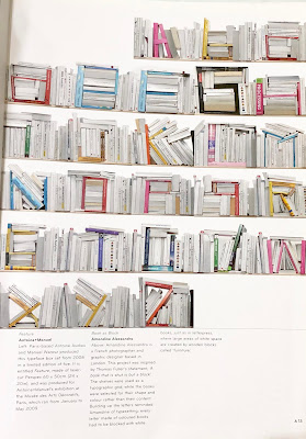
The 3D Type Book by Agathe Jacquillat and Tomi Vollauschek
 |
| Fig5.5: Book Cover |
One word to describe this book: Creative!
Picked this book up as the title and the front cover seemed interesting and different. In this book, I got to look at various letterforms created creatively in a three-dimensional form. The book showcases over 1,300 photographs of more than 300 projects!
I was fascinated by how man-made objects or even nature can be combined and beautifully shaped/arrandged to create all these letterforms. Looking at all these projects made me realise how typography doesn't just exist in a two-dimensional form on pen and paper or screen, and it can be created with pretty much anything in a three-dimensional form which I think is really cool.
 |
| Fig5.6: Letterforms created using coloured books |
 |
| Fig5.7: Letterforms created using flowers and plants |
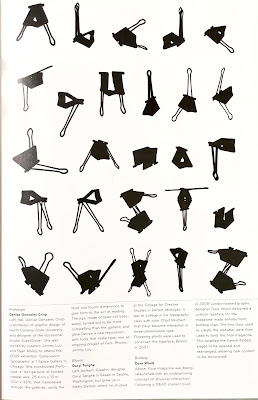 |
| Fig5.8: Letterforms created using binder clips |
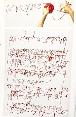 |
| Fig5.9: Letterforms created using a ball of yarn |
10/09/18 (Week 3)
New Typographic Design - Compiled and edited by Roger Fawcett-Tang, Introduction and essays by David Jury
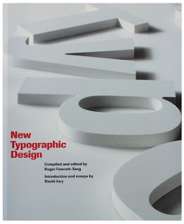 |
| Fig5.10: Book Cover |
This book serves as a visual guide to contemporary typographic designs, featuring various examples and usages of modern typography from across the world. It includes design for print such as books, magazines and posters as well as screen-based typography.
From this book, I got to look at various designs and it provided me with many great inspirations. Every composition was unique, with its own style, colour scheme and creative layouts. Some designs were minimal, while some had a lot going for it. Either way, there were all interesting to look at.


Wao, Great Man! I like you effort that's why I am here along with a font family that you can use everywhere;
ReplyDeleteRoyalty Free Fonts
Diamond Painting 2020
ReplyDeleteCartoons Diamond Paintings
Thanks for sharing the value information.
ReplyDeleteBest Branding Agency in Hyderabad
B2C and B2B refers to business-to-consumer and business-to-business respectively. Their similarity lies in that both B2B and B2C Marketing, consumers and businesses are customers.
ReplyDeleteVery nice article. Thank you for sharingLuxury Rigid Box Manufacturer
ReplyDelete