INTERCULTURAL DESIGN - FINAL PROJECT & PORTFOLIO
04/02/19 - 22/02/19 (Week 5 - Week 7)
Yeap Phay Min (0331073)
Intercultural Design
Final Project & Portfolio
(Week 6)
Once we had our collected data, we proceeded to come up with idea for our final outcome. We found time to meet up and start brainstorming on how to make use of the data we collected and visually express it through a design.
After some discussion, we came up with the idea of creating collectible cards.
Final Outcome Idea: Collectible Cards
Rationale
Korea’s traditional colours and motifs are both significant parts of their culture, and it can be found in various places and things around the country. Our concept is to showcase how colours and motifs work together harmoniously. Each colour has its own respective meaning. However, when you put these traditional colours together, it represents prosperity and an understanding of harmonisation with nature, to convey the importance of how harmony and nature hold in traditional Korean lifestyle. Our idea to visually express this aspect of their culture is to design and create a set of collectible cards, each containing a colour from the obangsaek and ogansaek colour spectrum. One side of the card will include illustrations relating to the Korean culture, while the other side of the card will have lines on them which can be placed together with the other cards to form a motif, like a puzzle. Through this, we can educate people on Korea’s culture, and show how colours and motifs work harmoniously with one another through the “puzzle”. If a card were to be left out, it may not form a complete motif and display all of the colours. All the traditional colours are needed to best represent their culture.
During Friday's tutorial class, we got to share our idea and concept to Mr Charles.
FEEDBACK: The idea is interesting and he likes it. He also mentioned we could create more cards because initially we wanted to create just 10 cards (one traditional colours for each). So, we went with 25 cards.
After receiving feedback, we started to list out the things we need to design in order to make our idea come to life.
We needed: cards with a motif and illustrations, a box packaging and a little booklet.
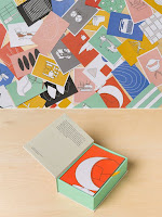
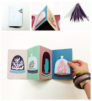
Here's our visual references for the packaging and little booklet.
For our colour scheme, we stuck with the traditional colours of obangsaek and ogansaek.
 |
| Colour Palette |
Before class ended, we discussed on what we could do during the weekends, and we agreed to individually sketched out our motif design to be used on the back on our cards.
Here's a compilation of the motifs exploration.
(Week 7)
This week, we met up again and agreed on one motif design to use.
 |
| Final Motif Design |
Then, we printed it out on A4 and cut it into 25 squares to try it out, as part of our mockup.
After that, we proceeded to add the colours to it and print it out again to see how it looks like when printed.
 |
| Final Motif Design on Card |
 |
| Printed Mock-up |
After that, we moved on to the illustrations. We wanted each card to have one illustration of something that relates back to Korean culture. To start off, we made a list of what to illustrate.
Back home, I started working on the illustrations.
While I was working on this, the others worked on the packaging and booklet.
Here's the processes of designing the packaging, including the mock-up.
Packaging Design Exploration:
Final Design:
Here's the process of designing the booklet, including the mock-up.
 |
| Final Design |
Once all the designs were done, we made our way to the printing shop.
Here are pictures of the printing, cutting and assembling process.
Once that was all done, I took it all back home to take pictures of it.
Behind the scenes of taking the pictures:
And lastly, after all that, here are pictures the final artwork by my group!


Woow! I love it, you did such a great job!! <3
ReplyDelete