INTERACTIVE DESIGN - PROJECT 2
25/10/18 - 1/11/18 (Week 9 - Week 10)
Yeap Phay Min (0331073)
Interactive Design
Project 2: Typosexual Typographic Exhibition - Collateral
LECTURE NOTES
25/10/18 (Week 9)
This week, we were told that our collateral is no longer an e-invitation, but instead a microsite. I learned that microsite is essentially a website that is separated from the main site, and it usually has a specific goal or target audience to it. There are also a handful of benefits such as cost, speed, good for experimental tool, having detailed information and more.
Moving on, we were introduced to bootstrap, and we got to briefly learn about it and how we can apply it to our designs. I also got to learn about the grid system in bootstrap.
 |
| Fig1.1: Grid System in Bootstrap |
 |
| Fig1.2: What the different codes mean |
INSTRUCTIONS
For this project, it is connected with our project from Advanced Typography class. In the project, we needed to use the key artwork created by applying it to 3 different mediums. One of the medium is an e-invitation, which is to be done in this class.
To view the other collaterals of this project done in the other class, click here.
INITIAL COLLATERAL: E-INVITATION CARD
18/10/18 (Week 8)
In this class we mainly focused on an exercise given to us. After I completed the exercise, Mr Shamsul mentioned that I could start with the e-invitation. I wasn't sure where to begin with, so I started searching up references, made some sketches and select a colour scheme.
 |
| Fig2.1: Sketches for e-invitation |
 |
| Fig2.2: Process of coding |
 |
| Fig2.3: Creating a simple html file for e-invitation |
MICROSITE
25/10/18 (Week 9)
Change of plans! This week, Mr Shamsul mentioned that we are no longer creating an e-invitation. Instead, we needed to create a microsite for the exhibition. The goal of the microsite could be to either invite people to the exhibition, sell the other collateral or both, and it should be in one page.
To start off, we should create wireframe sketches, select our fonts and colour scheme. We should also make sure our design relates back to our key artwork so there is some sort of a connection. I also starting thinking about the purpose of the website as well as the target audience.
Goal: The microsite will be mainly for promoting the Typosexual Typographic Exhibition, and at the same time invite people to attend the exhibition with a RSVP button added. (Merchandise of this exhibition can also be found.)
Target Audience: Students, designers, and basically anyone that has an interest in typography!
 |
| Fig2.4: Sketches for microsite #1 |
 |
| Fig2.5: Sketches for microsite #2 |
 |
| Fig2.6: Original Key Artwork |
 |
| Fig2.7: Variation of Key Artwork |
 |
| Fig2.8: Content for Microsite |
 |
| Fig2.9: Typefaces Used (Top: used in key artwork // Bottom: similar to poster) |
 |
| Fig2.10: Colour Scheme for Microsite |
 |
| Fig2.11: Tote Bag and Poster for the Shop |
 |
| Fig2.12: Social Media Icons - Facebook and Instagram |
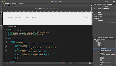
Once I gathered the necessary text and images, as well as the colours and typefaces, I started to create the microsite by coding both html and css in Dreamweaver. I actually ended up creating multiple files as I wasn't satisfied with how it look and since the file was cluttered with codes I kept deciding to just start fresh.
Here's are my initial attempts and the process of it.
 |
| Fig2.13: Process of coding in Dreamweaver |
 |
| Fig2.14: Initial plan for the layout |
Up until this stage, I noticed that I was really confused and lost about what I was actually coding about so I decided to stop styling the site with the css codes, and proceeded to start another file. I still wanted to give this layout plan another try before switching to a different layout plan.
 |
| Fig2.15: Process of coding in Dreamweaver |
 |
| Fig2.16: Another outcome of the initial plan for the layout |
I felt better about the second attempt but I ended up not liking how the plan of the layout was so I decided to try out a layout from a wireframe sketch I did. Eventually, after those attempts I had a clearer idea of what I want to create for my microsite.
Here are more of the processes on another different layout.
 |
| Fig2.17: Process of coding in Dreamweaver (html) |
 |
| Fig2.18: Process of coding in Dreamweaver (html) |
 |
| Fig2.19: Process of coding in Dreamweaver (css) |
 |
| Fig2.20: Process of coding in Dreamweaver (css) |
 |
| Fig2.21: Process of coding in Dreamweaver (html) |
Here's the outcome (not final) of the microsite.
 |
| Fig2.22: Initial Outcome of Microsite - Part 1 |
 |
| Fig2.23: Initial Outcome of Microsite - Part 2 |
 |
| Fig2.24: Initial Outcome of Microsite - Part 3 |
In this week's class, I got to show what I've done for the microsite. Mr Shamsul gave me some feedback on the microsite and with the feedback received I needed to make some minor adjustments to the microsite.
Mr Shamsul also mentioned that this project is due on Sunday, so I still have a few more days to make any necessary changes to my microsite before the submission date.
 |
| Fig2.25: Moodboard |
PDF of HTML File
PDF of CSS File
Here's the outcome of the microsite. (NOT FINAL)
 |
| Fig2.26: Outcome of Microsite - Part 1 |
 |
| Fig2.27: Outcome of Microsite - Part 2 |
 |
| Fig2.28: Outcome of Microsite - Part 3 |
We were also told to use 000webhost to upload our site.
 |
| Fig2.29: Process of Uploading Files to 000webhost |
(NOT FINAL) Link to site: http://jessica-yeap.000webhostapp.com
 |
| Fig2.20: Microsite on 000webhost - Part 1 |
 |
| Fig2.21: Microsite on 000webhost - Part 2 |
 |
| Fig2.22: Microsite on 000webhost - Part 3 |
22/11/18 (Week 13)
This week we received some feedback on our microsite. With the feedback received, I needed to make some minor adjustments to the site.
 |
| Fig2.23: Logo for the site |
 |
| Fig2.24: Process of coding in Dreamweaver |
 |
| Fig2.25: Process of coding in Dreamweaver |
After some adjustments, here is the final outcome of the microsite.
 |
| Fig2.26: Final Outcome - Intro |
 |
| Fig2.27: Final Outcome - About/Typosexual |
 |
| Fig2.28: Final Outcome - Event Details |
 |
| Fig2.29: Final Outcome - Shop & Footer (Copyright) |
 |
| Fig2.30: Final Outcome - Overview |
PDF of Microsite
Link to site on 000webhost: https://jessica-yeappm.000webhostapp.com
FEEDBACK
25/10/18 (Week 9)
Specific feedback: For the second project, the wireframe sketches I’ve done are acceptable and I can proceed with creating the microsite.
1/11/18 (Week 10)
General feedback: The file should always be named as index.html, and not something else.
Specific feedback: For the main section of my microsite, I should only place one picture as having two pictures made the layout seem a little odd. I should also be aware of the line spacing and the font size. As for the style of the microsite, the colour scheme as well as the typefaces I chose are good.
22/11/18 (Week 13)
Specific feedback: For project 2’s microsite, I could add a logo using the words “typosexual” from my artwork arranged horizontally, and the button should have a border to make it look more like a button. Overall, Mr Shamsul said the microsite was good.
REFLECTION
EXPERIENCE
25/10/18 (Week 9)
For this project, I got to create a microsite for the Typosexual Typographic Exhibition. I got to use the information and artwork I've created from Advanced Typography class and incorporate it into the microsite, making sure the style, colours and typefaces used have some sort of a connection with the artwork and other collaterals done. With that said, I got to gain experience on coding the html and css files in Dreamweaver to create the microsite. Overall, this was a good experience as I got to be more familiar with coding.
1/11/18 (Week 10)
This week, I got to make some adjustments to the microsite before submitting it, as well as uploading my files to a server.
OBSERVATION
25/10/18 (Week 9)
Through creating the microsite, I observed that it is not as easy as it seems and it can be frustrating at times. One slight adjustment to an element could potentially affect the arrangement of other elements, as well as how sometimes the codes wouldn't work as it is typed and placed incorrectly.
1/11/18 (Week 10)
I observed that it is important to name the file as index.html and not something else as it can affect the outcome.
FINDINGS
25/10/18 (Week 9)
I found myself to be struggling at times where I couldn't get the microsite to look like how I want it to be through coding in Dreamweaver. I also found myself thinking back on how it was mush easier to design a page using Illustrator. This project was quite a challenge for me as I am not familiar with coding, but I also found that I was quite satisfied with the outcome even though it's not the best.
1/11/18 (Week 10)
Through it all, I found that I learned new things regarding coding which will help me when it comes to the final project.
FURTHER READING
Web Design - Introductory Concepts and Techniques by Shelly Napier Rivers
 |
| Fig3.1: Book Cover |
This book consists of informative content, such as the consideration of target audience, design principles, colours, typography and others that's needed to be thought about while creating successful websites. The book also has content about HTML which I thought would be great to read up since we're learning about it.
HTML (Hypertext Markup Language)
- This is one of the markup language used to create web pages
- HTML markup language defines how the elements of a web page are formatted and presented with predefined codes that are called HTML tags.
- HTML tags should be in lowercase, surrounded by brackets and inserted in pairs
- Example: <html>web page content</html>
- When a web page is opened into a browser, the HTML tags are red and interpreted to show the page with the organised content such as text, images and links.
- Creating a simple web page can be done by typing HTML tags along with the content into a documents that's created in a plain text editor such as Notepad.
I also got to read up and learn about the basic web design principles.
Basic Web Design Principles
- Balance: harmonious arrangement of elements
- Symmetry: centered/balanced, suggests a safe and peaceful atmosphere
- Asymmetry: off balanced, for a more fun and energetic mood
- Proximity: placing elements that have a relationship close to each other
- White Space: empty space surrounding text/images
- Contrast: mix of elements to stimulate attention
- Unity: sense of oneness/belonging
- Visual Identity: combination of design elements identified with site and publisher
- Alignment: placements of elements in fixed or predetermined positions, rows or columns


Comments
Post a Comment