PACKAGING AND MERCHANDISING DESIGN - FINAL PROJECT
10/06/19 - 08/07/19 (Week 11 - Week 15)
Yeap Phay Min (0331073)
Packaging and Merchandising Design
Final Project
LECTURE NOTES
17/06/19 (Week 12)
Lecture #9: Merchandising & Visual Merchandising Design
For this week's lecture, a group presented on the topic of merchandising and visual merchandising design. Through the lecture, we learned that merchandising is the planning and promotion of sale by presenting the product to the right market at a right time. The types of merchandising include product merchandising, retail merchandising, digital merchandising, omnichannel merchandising and visual merchandising. Looking deeper into visual merchandising, it is the aesthetic display with the aim of attracting potential consumers. Examples of this include display windows, store layout, product displays and point of purchase display. As for visual merchandising design, examples include mannequins, lighting design, cross merchandising and seasonal displays.
INSTRUCTIONS
*The brief of this final project his now different from the MIB. For this project, we are to collaborate with the interior architecture students. They are required to come up with a brand and create a space for it. As for us, we are suppose to help with the branding aspects such as the logo design, come up with 3 merchandise for it and also a packaging to hold all the merchandise.
10/06/19 (Week 11)
To start this project, we were given a brief on what we are required to do. Later on, we met up with the interior architecture students and were assigned to our partners. According to your partner's brand, create 3 merchandise and 1 packaging. Once I knew who and what brand I was assigned to, I took pictures of the notes he made.
 |
| Fig 1.1: Notes #1 |
 |
| Fig 1.2: Notes #2 |
To be honest, initially when I first saw his notes I felt scared as I was overwhelmed by the drawing he did of a chilli pen and in the moment I felt lost as to how I am suppose to come up with ideas of this. However after listening to his explanation of his brand I was less confused and had better idea of the possibilities of the merchandise I could do. My first thought was that this is really out of my comfort zone. It's also funny how for Brand Corporate Identity class I created a macaron brand which revolves around sweetness, and now I'm doing the complete opposite of sweet which is spicy.
To sum it up, his brand is all about chilli. The brand name is "unsweet" and the place will have workshops/classes for cooking and planing chilli. There will also be a shop whereby people can buy the brand's special chilli pen which is inspired by those pens where you could click down the colour you want.
I started by brainstorming a bunch of merchandise ideas.
The initial ideas included:
- Apron
- Badges
- Stickers
- Cards (welcome, thank you, quote/tagline...)
- Wooden spoon
- Chopping board
- Knife (a little dangerous so maybe not)
- Tote bag
- Small notebook
- Book of chilli recipes?
12/06/19 (Week 11)
During tutorial class, I started to try out some logo designs. The IA student had one logo design in mind but allowed me to further refine it. Before that I experimented with several different typefaces that would suit the brand and also the colour palette.
 |
| Fig 1.3: Typeface Exploration |
I decided to go with the first one as I liked the texture of it.
 |
| Fig 1.4: Selected Typeface |
 |
| Fig 1.5: Colour Palette |
 |
| Fig 1.6: 1st Round of Logo Exploration |
While consulting with Mr Shamsul, he mentioned that the merchandise idea could be focused on one department. Therefore I decided in the end to focus on the cooking department as I had more idea on the merchandise I could create for it. As for the typeface and colour palette, it is acceptable and I can proceed with it. For the logo, he mentioned that the one with the words in the chilli is more interesting.
17/06/19 (Week 12)
This week, I continued to think of the merchandise. I've narrowed down my ideas to apron, wooden spoon or chopping board, and a small notebook. I also searched up some references for it.
 |
| Fig 2.1: Merch References |
I also started to think about the overall packaging and search up references for it as well.
 |
| Fig 2.2: Box References |
As for the logos, I've done a couple more and sent it to the IA student to see what was his opinion on it.
 |
| Fig 2.3: Logo Exploration |
After I sent the image he suggested that I could add more squares to the logo as it would match with his design elements of the space he was creating. Kinda hesitating, but I still gave it a shot and tried adding the square elements.
 |
| Fig 2.4: Logo Exploration With Squares |
19/06/19 (Week 12)
During consultation, I got to show Mr Shamsul the logos I've done along with what the IA student have suggested to me. He mentioned that the logos I've done previously without the square are better as it is minimal and more user friendly. The squares kinda make it look too complex. He also said we don't have to follow them as it is up to us to decide what the design should look like. As for the merchandise ideas, it was okay and I can proceed with the designs of it. The packaging references of the box with the folding part is interesting and I could try to do something of that sort. He also mentioned I could use corrugated cardboard as my packaging could look sustainable and organic.
Later on, I refined the final logo and the IA student was okay with it as well so yay.
 |
| Fig 2.5: Final Logo |
24/06/19 (Week 13)
For this week, I started to experiment with the designs of the merchandises. I also created some patterns as I felt like I needed some sort of visuals because if it is just one logo throughout the designs it may get boring? So I explored some patterns I could possibly make use of.
 |
| Fig 3.1: Pattern Exploration #1 |
 |
| Fig 3.2: Pattern Exploration #2 |
 |
| Fig 3.3: Pattern Exploration #3 |
26/06/19 (Week 13)
Wednesday aka consultation day. Mr Shamsul mentioned that her preferred the third pattern so I proceeded to try out the designs of my merchandise and try to incorporate the pattern in some of them. For the merchandise, I decided to go with a chopping board instead of a wooden spoon as the surface of the board is flat and it would be easier to laser cut on it. I also decided to have some extras such as a welcome card to put in the box, a tag to tie around the chopping board and also a sleeve to wrap my apron with.
 |
| Fig 3.4: Apron Designs |
 |
| Fig 3.5: Chopping Board |
 |
| Fig 3.6: Notebook |
 |
| Fig 3.7: Welcome Card + Tags |
 |
| Fig 3.8: Sleeve for apron |
Later on in the week, I also started to sketch out how the items could be laid out so I could try to make a mock-up for the box packaging. I managed to buy corrugated cardboard to create the mockups.
 |
| Fig 3.9: Sketches #1 |
 |
| Fig 3.10: Sketches #2 |
 |
| Fig 3.11: Sketches #3 |
With the mockup, I decided to go with a standard box design first, then figure out how I wanted to add on the flap that is able to fold out. I didn't want to jump straight to creating that as I would just get confused on how to cut the shape of it. Here are some pictures of the box mockup I made.
 |
| Fig 3.12: Mockup |
 |
| Fig 3.13: Mockup |
With the mockup, I tried to play around with the arrangement of the merchandises.
 |
| Fig 3.14: Trying out the arrangement |
01/07/19 (Week 14)
In Monday's class, I brought the box to class to receive feedback on it. Mr Shamsul said the flaps should be curved and not as slanted so that when it closes it will be tighter. I could also try out my idea of have the extra flap. As for the designs of the merchandise, I mostly finalises them and can proceed with executing them. My plan was to use the laser cut studio on Wednesday to engraved on the chopping board and also laser cut the dieline for my box.
Here are my final designs for the merchandise.
 |
| Fig 4.1: Chopping Board |
 |
| Fig 4.2: Apron |
 |
| Fig 4.3: Notebook - Front & Back |
 |
| Fig 4.4: Extras - Welcome Card + Tags |
 |
| Fig 4.5: Extras - Sleeves for apron and box |
03/07/19 (Week 14)
On this day I got to use the laser cut studio to get my chopping board engraved. I got to test it out on some wood from the studio before laser cutting on the actual one as I only bought one chopping board. Oops.
Here are some pictures from laser cutting.
 |
| Fig 4.6: Laser cut |
 |
| Fig 4.7: Trying it out first |
 |
| Fig 4.8: Time to engrave on the actual item |
 |
| Fig 4.9: Success! |
I also got to laser cut my box.
 |
| Fig 4.10: Dieline |
 |
| Fig 4.11: Laser cut on corrugated cardboard |
 |
| Fig 4.12: Getting the apron printed |
 |
| Fig 4.13: Outcome of the printing |
 |
| Fig 4.14: Getting more things printed at the printing shop |
 |
| Fig 4.15: Card |
 |
| Fig 4.16: Notebook |
Back home I proceeded to cut the rest of the stuff including the box.
I tried to assemble the box carefully because once again I did not think of laser cutting more corrugated cardboard when I have extras laying around my house.
 |
| Fig 4.17: Assembling box |
 |
| Fig 4.18: Trying out the arrangement of merchandises |
 |
| Fig 4.19: Cutting the sleeves |
 |
| Fig 4.20: Printed the pattern on sticker paper to decorate the box |
 |
| Fig 4.21: Process of assembling everything |
After a lot of time and effort spent on planning, designing, printing and cutting, I was finally done with it all. In the weekend I got to take pictures of the final outcome for submission next Monday.
Here are some behind the scenes pictures.
 |
| Fig 4.22: Attempting to take pics of merchandises |
 |
| Fig 4.23: Attempting to take pics of the box |
 |
| Fig 4.24: Placing my phone on a selfie stick in the hopes of creating a stop motion |
 |
| Fig 4.25: Set up for stop motion attempt |
08/07/19 (Week 15)
Submission day. Here is the final outcome for the final project of this module.
Merchandise
01 Apron
 |
| Fig 5.1: Apron with logo design |
 |
| Fig 5.2: Apron wrapped with a sleeve |
 |
| Fig 5.3: Apron wrapped with a sleeve |
02 Chopping Board
 |
| Fig 5.4: Chopping Board |
 |
| Fig 5.5: Close-up of the engraved logo |
03 Notebook
 |
| Fig 5.6: Notebook- Front |
 |
| Fig 5.7: Notebook - Back |
Extras
 |
| Fig 5.8: Welcome Cards - Front & Back |
 |
| Fig 5.9: Tags |
 |
| Fig 5.10: Sleeve |
Compilation of Merchandises
 |
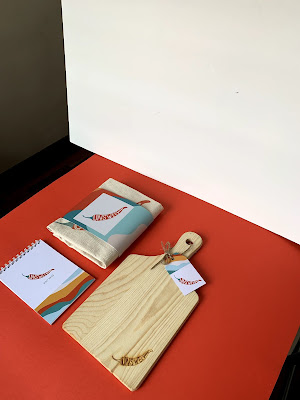
| Fig 5.11: Compilation |
 |
| Fig 5.12: Compilation |
Box Packaging
 |
| Fig 5.13: Box with sleeve |
 |
| Fig 5.14: Pulled out sleeve revealing sticker logo on box |
 |
| Fig 5.15: Front angled view |
 |
| Fig 5.16: Side angled view |
 |
| Fig 5.17: Box with sleeve |
 |
| Fig 5.18: Box without sleeve |
 |
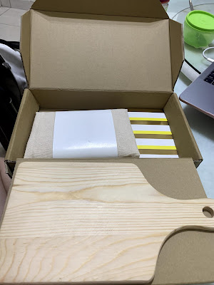
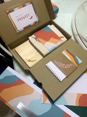
| Fig 5.19: Box opened revealing all the merchandises |
 |
| Fig 5.20: Compilation of merchandises and box packaging |
 |
| Fig 5.21: Compilation |
Stop Motion
 |
| Fig 5.22: Stop Motion |
Slides for Google Classroom Submission:
FEEDBACK
10/06/19 (Week 11)
The logo idea of having the words in the chilli is interesting and I can develop further from there. As for the items, I could select a department from the space and create merchandises based on that department.
17/06/19 (Week 12)
Stick to the logo design that is more minimal as it is also more user-friendly as compared to the logo with square designs as suggested by the ia student. Selection of items and visual references of them are okay.
24/06/19 (Week 13)
Finalised logo is good to go. The pattern can be the wavy one. As for the packaging, mockups should be done to have a better of how to place my items. I could also play around with the arrangement of the items first by creating flat lays of them.
01/07/19 (Week 14)
The packaging box flap's could be curved and not too slanted for a tighter close. Designs for merchandises are okay and can proceed with the execution of it.
REFLECTION
EXPERIENCE
That's the end of this project, of this module. With this project, it was definitely an interesting one for me as I got to design merchandises for a brand that I would not have thought about doing. Through it all, the failures and successes, I got to learn a lot. The box was what I struggled with the most as I found it hard to make sure the folds of the cardboard to be all neat and perfect. It really did test my patience at times as I felt frustrated when I couldn't get things done the way I expected it to be. I'm still learning to be less harsh on myself and the work I create. Overall, this project was a good experience for me and I really enjoyed seeing everything come together in the end.
OBSERVATION
Throughout the weeks, I observed that I actually enjoy working with brighter colours and that does not happen often as most times I would stick to my lighter and duller shades. With this project and me having a brand that's all about chilli and spiciness, I told myself that my go-to lighter colours would not suit this brand and bright colours were the way to go. I feel like I'm making such a big deal about colours right now but I did observe how much I liked the look of the vibrant colours especially when it was all printed out.
FINDINGS
In general, as cheesy as it sounds, I found that all the mistakes I made were great in helping me learn as I had to take time to figure out what went wrong and what did I need to do to not repeat the mistakes again. With the project in particular, I also noticed how satisfying it was to see the designs being consistent with one another which made me further think about the importance of maintaining consistency in the designs we create. Besides that, I found that feedback is not only important but also really helpful to me as I would feel stuck with my designs when I stare at it for too long and hearing other's opinions does help.
FURTHER READINGS
Why Your Product's Packaging is as Important as the Product Itself
By: Joshua Conran
https://www.inc.com/joshua-conran/why-your-product-s-packaging-is-as-important-as-the-product-itself.html
 |
| Article Cover |
Looking at Tiffany & Co. as an example, the brand's iconic Tiffany Blue colour is said to be more recognisable than the actual jewellery itself. As for Apple, they are known for their clean and minimal packaging. Packaging is powerful. It communicates with the consumers, telling them what the product is and why is it different from others. Packaging also has the ability to influence a company's sales as it grows too.
How to Design Packaging That Makes an Impact?
1. Know your demographic
- Do not be afraid to go bold with your brand. Each brand should have its own identity to speak for themselves.
2. Make cheap packaging look chic and personalised
- Good packaging doesn't have to be expensive. You can make it look expensive with the colours and stylish typography. An inexpensive solution that gives the item a high-end feel.
3. Make the package part of the experience
- A reason why its so fun to unbox an Apple product is that the packaging design reflects the sleek user friendly experience of the product inside.
4. Consider eco-friendly options
- Having recyclable and reusable packaging can be a factor as to why your consumer chooses your brand over another.


Thank you for sharing this blog.Jam Jam Group is one of the leading industry offering best retail packaging, Raipur, Ahmedabad & Delhi locations.
ReplyDelete