PACKAGING AND MERCHANDISING DESIGN - PROJECT 2
06/05/19 - 27/05/19 (Week 6 - Week 9)
Yeap Phay Min (0331073)
Packaging and Merchandising Design
Project 2 - Traditional Toy Packaging
LECTURE NOTES
29/05/19 (Week 10)
Lecture #8: Packaging and Branding
This week's presentation was done by my group, and it is on the topic of packaging and branding. In our presentation, we gave a brief introduction on branding, and discussed about branded house and house of brands. Examples were shown to illustrate the explanation as well. Factors regarding the importance of branding in packaging were shown, which included recognition and increase perceived value. Besides that, branding is represented in packaging through logo, colours, typography and material selection.
INSTRUCTIONS
06/05/19 (Week 6)
This week, we were introduced and briefed on our next assignment which is about creating a packaging for a traditional Malaysian toy.
List of Traditional Malaysian Toy/Games
1. Congkak
2. Gasing
3. Capteh
4. Batu Seremban
5. Mahjong
6. Wau
7. Sepak Raga/ Sepak Takraw
8. Chinese Yo-yo
9. Chinese Chess
In the end, I decided to go with a capteh. I started with researching about the toy and find some initial packaging design references. I compiled these into a set of slides.
Once I had the product with me, I started with some initial rough sketches of the possible packaging structure.
 |
| Fig1.1: Selected Product |
 |
| Fig1.2: Rough Sketches |
13/05/19 (Week 7)
Next, I measure the product so I could work on the dieline of the packaging according to the measurements taken.
 |
| Fig2.1: Measurements + Colours of the Capteh |
 |
| Fig2.2: Dieline |
20/05/19 (Week 8)
 |
| Fig3.1: Process of making the mock-up |
 |
| Fig3.2: Process of making the mock-up |
Outcome of the mock-ups created:
 |
| Fig3.3: Actual size (L), small mockup (R) |
 |
| Fig3.4: Small mockup |
 |
| Fig3.6: Actual size |
 |
| Fig3.7: Actual size - the opening flap at the top |
 |
| Fig3.8: Inside |
 |
| Fig3.9: With capteh inside |
Before I started to design the surface of the structure, I came up with a brief moodboard and started on some illustrations.
 |
| Fig3.10: Brief Moodboard |
 |
| Fig3.11: Illustrations |
After that, I started to play around and experiment with the designs of the packaging so I could have a better idea of how I want the outcome to look like. I also explored with the colour for the base of the packaging. Through the colour exploration I found that the combination of a blue base with yellow text on it reflects back on Malaysian's flag colours, so I felt that would suit the whole theme of this. But I still tried out other colours besides blue such as purple and turquoise.
Design Explorations:
 |
| Fig3.12: Rough ideas for the front |
 |
| Fig3.13: Design Exploration |
 |
| Fig3.14: Design Exploration |
 |
| Fig3.15: Design Exploration |
 |
| Fig3.16: Design Exploration |
 |
| Fig3.17: Design Exploration |
I continued to work on the designs. I've also decided to change up the colours and illustrate more elements that would reflect Malaysia's culture.
 |
| Fig4.1: Updated Colours |
 |
| Fig4.2: Capteh illustration with the updated colours |
For the added elements, I decided to go with some batik motifs, the star from Malaysia's flag and a hibiscus as it is Malaysia's national flower.
 |
| Fig4.3: Star from Malaysia's Flag |
 |
| Fig4.4: Hibiscus - National Flower |
 |
| Fig4.5: Batik Floral Motifs Sketches |
 |
| Fig4.6: Digitised Motifs |
 |
| Fig4.7: Pattern Exploration |
 |
| Fig4.8: Pattern Exploration |
Updated Moodboard:
 |
| Fig4.9: Updated Moodboard |
Once I had the visual I started to explore with the designs.
Design Explorations:
 |
| Fig4.10: Packaging Design Exploration |
 |
| Fig4.11: Packaging Design Exploration |
 |
| Fig4.12: Packaging Design Exploration |
 |
| Fig4.13: Packaging Design Exploration |
 |
| Fig4.14: Packaging Design Exploration |
 |
| Fig4.15: Packaging Design Exploration |
 |
| Fig4.16: Packaging Design Exploration |
 |
| Fig4.17: Packaging Design Exploration |
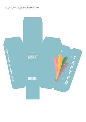
While coming up with the designs, I realised that I should make some changes to the dyeline so that when the packaging is folded, that folding part won't be seen at the front.
 |
| Fig4.18: Updated Dieline |
 |
| Fig4.19: Final Packaging Design |
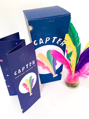
Besides the packaging, I also designed a little infographic booklet to include inside the packaging. The contents of it include what it is, the history, what it is made of and how it's played.
 |
| Fig4.20: Inside |
 |
| Fig4.21: Outside |
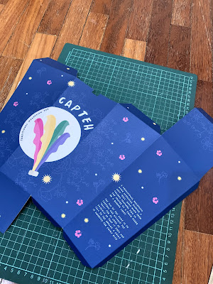
At the end of the week, I went and got it printed and then cut and assemble it, the usual.
 |
| Fig4.22: Printed documents |
 |
| Fig4.23: Cutting |
 |
| Fig4.24: Creating the folds |
 |
| Fig4.25:Assembling |
10/06/19 (Week 11)
Submission Week
Here are pictures of the outcome.
 |
| Fig5.1: Front View |
 |
| Fig5.2: Angled View |
 |
| Fig5.3: Side View |
 |
| Fig5.4: Back View |
 |
| Fig5.5: Side View |
 |
| Fig5.6: Close-up of Design |
 |
| Fig5.7: Top View |
 |
| Fig5.8: Top View - Flap Opened |
 |
| Fig5.9: Top View - Flap Opened, Design at the Bottom |
 |
| Fig5.10: Booklet Front View |
 |
| Fig5.11: Outside of Booklet Design |
 |
| Fig5.12: Intside of Booklet Design |
 |
| Fig5.13: Packaging + Product |
 |
| Fig5.14: Compilation |
 |
| Fig5.15: Compilation |
I also compiled it in a set of slides.
Towards the end of the semester, I decided to get the box reprinted and make the closing tighter.
 |
| Fig 6.1: Updated & Final Design |
 |
| Fig 6.2: Final Box |
 |
| Fig 6.3: Compilation - Box, Booklet & Capteh |
FEEDBACK
20/05/19 (Week 8)
Specific feedback: [online] Looks nice but need to remember from the brief. I mentioned something to do with promoting Malaysia as a diverse cultured country.
10/06/19 (Week 11)
Specific feedback: The overall design of the outcome is acceptable with the added elements of the star, hibiscus and batik as part of Malaysia's culture. As for the structure of the box, the top flap is a bit loose and I could actually have a different way of locking it.
17/06/19 (Week 12)
Specific feedback: [online] Well constructed packaging. Visual used is very interesting. However the material and color of the box and leaflet is not the same and there's no consistency between both items
REFLECTION
EXPERIENCE
In this project, I had the experience of creating a packaging for a traditional game/toy. I found this to be interesting as not all of the traditional game/toy come with a packaging. The item that I chose was a capteh which did not come with a packaging so it was fun yet also challenging to come up with a packaging for it. While designing it, I also felt lost at times as I did not know how to to make it represent Malaysia and the culture. When it comes to the construction of the box, I also had some struggles with the closing of the box. Overall, this was a good experience for me to learn from the mistakes I've made.
OBSERVATION
Through this project, I observed that not all traditional toys are sold with a packaging, so this project was interesting. I also observed that the overall design will look better if it does reflect back on the actual product, and reflect back on the culture it came from. As for the shape and structure of the box, I observed that the shape needs to be reasonable and match the shape of the actual product.
FINDINGS
As for the finings of this project, I found that I was still playing it safe by using "normal and basic" materials such as art card. I have yet to venture out into other materials that might make the overall structure and design more sturdy and maybe even nicer? Overall, I found this project to be a good learning experience for me when it comes to creating the design and also constructing the box.
FURTHER READINGS
The Five Things Product Packaging Must Do
By: Simon Preece
https://www.forbes.com/sites/onmarketing/2014/07/23/the-five-things-product-packaging-must-do/#d090a6f3ac4f
This article discusses effective packaging. In order to be successful, every brand should include a distinctive point of view to be able to convey the clear and unique reason for being. The article also mentions that an effective packaging makes it easy for people to understand at a glance. Naturally the product has to be able to deliver on the promise of what it can bring to consumers, in order to ensure repeat purchase.
1. Stand out
There has to be a point of orientation on the packaging that can draw the attention of the consumers. If it's just covering the shelf and shouting louder than others, that won't cut it and make it stand out among the others.
2. Be simple
A simple design is said to be more effective. In the article, it states that a market is often busy and hence we rarely experience visuals that are clean and calm.
3. Pass the five-year-old test
With this test, it includes describing your brand to a five-year-old and send them to a store to look for it. If they can find it, then it is said in the article that the packaging creates an iconic connection. Consumers will come back week after week looking for this because of the connection made.
4. Trigger emotional engagement
Consumers will react when there is a feeling felt and created from the brand. There is nothing more powerful in packaging than eye contact.
5. Create iconic assets
A series of visual equities is created in a good packaging. For example, Coca-cola. The brand has its own assets and brand identities, such as the colours red, logo typography, dynamic contour wave and iconic bottle shape.


Thanks for Sharing such imported information with us. I hope you will share some more info about PACKAGING AND MERCHANDISING DESIGN. please keep sharing!
ReplyDeleteCorporate Identity Design Packages
Great insights! Effective Merchandising Services play a crucial role in packaging and design, ensuring products attract customers while maintaining brand consistency.
ReplyDeletehi
ReplyDeleteLove how innovative the packaging design is! It really stands out on the shelves and makes the product feel so special
ReplyDeletevisit our website packaging design los angeles
This project on Packagingand merchandising design is very well presented. I like how the concept focuses not only on the packaging itself but also on how the product is positioned and displayed. The traditional toy packaging idea adds a cultural and creative touch, making it more engaging and meaningful. A great combination of design thinking and visual presentation!
ReplyDelete