TYPOGRAPHY - PROJECT 2

22/05/18 - 05/06/18 (Week 9 -Week 11)
Yeap Phay Min (0331073)
Typography
Project 2 - Font Design
_____________________________________________________
LECTURE NOTES
05/06/18 (Week 11)
Lecture 4: Typography in Different Medium (Print / Screen)
This week, we got a lecture by Mr Shamsul about print and screen. We learned that typography doesn’t just exist on paper, but also on screen. I also got to understand about fluctuating parameters, which talks about how the sizes of text may differ on different devices. When it comes to print, it is important that the type is legible and the good type includes Calson, Garamond and Baskerville. As for screen types, it enhances the readability and performance as it is on screen rather on paper. The letters also appear to be wider, with a taller x-height.
Moving on with the lecture, discussed about hyperlink, which essentially is a word that can be clicked to open to a new document. It is also often in the colour blue. In addition to that, we also learned about system fonts. I understood that each device has its own collection of pre-installed font selection. When it comes to pixel differential between devices, each screens have different sizes and the text has different proportions as well. Lastly, we discussed about the difference between static and motion text. Static text has minimal characteristics that are often informational, promotional and formal. As for motion, this is commonly used to dramatise type and it can be found in motion graphics such as the end credits of a video/movie.
_____________________________________________________
INSTRUCTIONS
PROJECT 2 - FONT DESIGN
22/05/18 (Week 9)
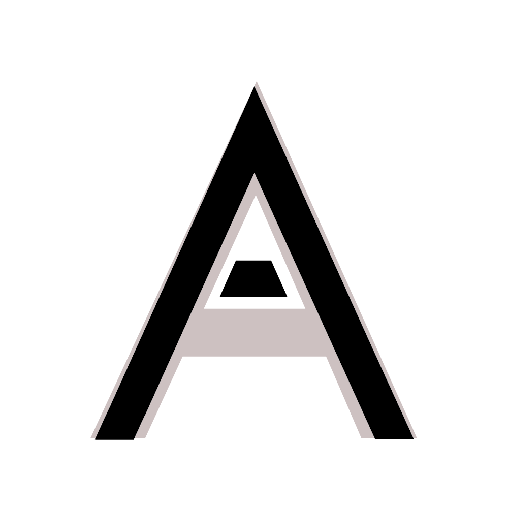
In this project we were required to re-design a font for the word ‘TAYLOR’S’ that would match the mark (logo). We started by studying the 10 type families given by our lecturer, then sketching out our ideas on graph paper. Once I had my idea, I moved on by transferring it to Adobe Illustrator.
In this project we were required to re-design a font for the word ‘TAYLOR’S’ that would match the mark (logo). We started by studying the 10 type families given by our lecturer, then sketching out our ideas on graph paper. Once I had my idea, I moved on by transferring it to Adobe Illustrator.
 |
| Fig1.1: Trying out the word 'TAYLOR'S" on different types |
 |
| Fig1.2: Sketches #1 |
 |
| Fig1.3: Sketches #2 |
 |
| Fig1.4: Artboards in Illustrator of original letters (Futura Std) |
 |
| Fig1.5: Initial letters I created (in black) |
 |
| Fig1.6: Initial Outcome of Letters |
05/06/18 (Week 11)
This week, we got to show Mr Vinod what we've created and he gave us feedback on how to improve it. Once that it once, we learned how to transfer what we've design in Illustrator and transfer it to FontLab Studio.
 |
| Fig 1.7: Final 'T' |
 |
| Fig 1.8: Final 'A' |
 |
| Fig 1.9: Final 'Y' |
 |
| Fig 1.10: Final 'L' |
 |
| Fig 1.11: Final 'O' |
 |
| Fig 1.12: Final 'R' |
 |
| Fig 1.13: Final ' |
 |
| Fig 1.14: Final 'S' |
 |
| Fig 1.15:Final artboards with original letter (Futura) behind |
 |
| Fig 1.16: Final Outcome of letters |
 |
| Fig 1.17: Screenshot of FontLab Studio |
____________________________________________________
FEEDBACK
22/05/18 (Week 9)
General feedback: For the font design project, the strokes should be consistent and appropriate to the mark. We should look into the details such as the proportions, consistency and balance. We should also keep our blog up to date.
Specific feedback: As for the font design for Taylor’s, I should look into the details such as making the angles consistent so it’ll looks better.
Specific feedback: As for the font design for Taylor’s, I should look into the details such as making the angles consistent so it’ll looks better.
05/06/18 (Week 11)
General feedback: We shouldn’t feel scared to ask questions as asking questions will help us to learn. When we create the letters, we shouldn’t make a lot of changes to every single letter as that will just overcomplicate the whole thing. We should also carefully study the letters.
Specific feedback: I could make some of the letters wider to make the proportion of the overall letters better and more consistent. I should also look at the thickness of my reference font.
_____________________________________________________
REFLECTION
EXPERIENCE
22/05/18 (Week 9)
This week, I got to learn how to create fonts using the rectangle tool, pen tool and pathfinder tool on illustrator.
05/06/18 (Week 11)
We learned how to create our Owen fonts using FontLab Studio which I found to be interesting.
05/06/18 (Week 11)
We learned how to create our Owen fonts using FontLab Studio which I found to be interesting.
OBSERVATION
22/05/18 (Week 9)
I observed that it is important to make use use of the guidelines so the sizing and placement of the letters are consistent and properly aligned.
05/06/18 (Week 11)
I observed that the letters will look better overall, if we only make minor changes instead of overcomplicating it.
05/06/18 (Week 11)
I observed that the letters will look better overall, if we only make minor changes instead of overcomplicating it.
FINDINGS
22/05/18 (Week 9)
I found that when the letters designed have some sort of consistency by making the strokes and gaps the same width, it makes the overall outcome look much better.
05/06/18 (Week 11)
I realised that I should've carefully study the thickness of the font so when I'm creating the new font it'll have some sort of similarity and consistency.
05/06/18 (Week 11)
I realised that I should've carefully study the thickness of the font so when I'm creating the new font it'll have some sort of similarity and consistency.
_____________________________________________________
FURTHER READING
22/05/18 (Week 9)
An Essay on Typography by Eric Gill
 |
| Fig2.2: Book Cover |
This book consists of essays on different topics written by Eric Gill, which also stated that 'a good piece of lettering is as beautiful a thing to see as any sculpture or painted picture'. Gill is a creator of many classic typefaces that are commonly used in the world today, which has made an impact on modern graphic designs.
I was drawn to the section of the book titled 'lettering'. Eric Gill mentioned that letters are not illustrations or representations, but instead are more and less abstract forms. From this book I also got to learn about how the first printed books were simply known as typographic imitations of writings by pen. He also mentioned that letters are letters whether it is created by machines or by hands, but it is more desirable for modern machines to make letters as it is more compatible.
05/06/18 (Week 11)
Type Team by Tony Seddon
This book contains a variety of guides for anyone who wants to combine individual typefaces for any sort of creative project. The author states that choosing a typeface is like deciding what type of music to listen to. We end up picking a certain music due to what catches our eye, what mood we're in and what we're doing. Well, picking a typeface are like that too! We pick them for different reasons to match the text.
From the chapter "Hierarchy is important", I understood that when it comes to selecting a typeface for a certain project, it is important to pay attention to the number of available weights in each of the type family. For example, if you choose a wider/thicker type style for a text compared to a narrow/thin style, it will most likely stand out and therefore create hierarchy.
05/06/18 (Week 11)
Type Team by Tony Seddon
 |
| Fig2.3: Book Cover |
From the chapter "Hierarchy is important", I understood that when it comes to selecting a typeface for a certain project, it is important to pay attention to the number of available weights in each of the type family. For example, if you choose a wider/thicker type style for a text compared to a narrow/thin style, it will most likely stand out and therefore create hierarchy.
 |
| Fig2.4: Example from a page of the book |

Comments
Post a Comment