TYPOGRAPHY - PROJECT 1
08/05/18 (Week 7) - 23/05/18 (Week 9)
Yeap Phay Min (0331073)
Typography
Project 1 - A Story Book
_______________________________________________________________
LECTURE NOTES
Lecture 3: Text / Tracking : Kerning and Letter Spacing
08/05/18 (Week 7)
From the lecture given this week, I learned that ‘kerning’ is the term used to explain to process of adjusting the space between two letters by reducing the gap. This may be confused with the term ‘letter spacing’, but the difference is that ‘letter spacing’ occurs when you increase the space between the letters, unlike kerning which reduces the space.
 |
| Fig 1.1: Example of Kerning |
We also talked about logos which is an identity / symbol that represents a company. As for the usage of uppercase, it may be hard to read when used for a large passage of text as there aren’t many hints. Moving on from that, I learned about the term ragging. If a text is flushed to the left, it is said to be ragged right. If a text if flushed to the right, it is said to be ragged left. As for entered alignment, it should be used limitedly as if it used in a passage it will affect the readability. I was also introduced to the word ‘rivers’ which talks about the space between words. A well justified text can be done with the use of kerning to present a text clearly. If a text is too distracting, the message/information will not be conveyed effectively. It is also important to understand how different types feel as text to know which typeface suits the text best.
Lecture 4: Text / Indicating Paragraphs
15/05/18 (Week 8)
In this lecture, I got to understand about line spacing, also known as leading. If a leading is 12pt, the paragraph space should be 12pt as well. And if we were to click shift enter to create a force line break, it will follow the leading space. We also talked about letterpress and how it used lead pieces to create sentences, and in between 2 sentences a lead strip is place to create leading.
As for the term indentation, it is the gap in the first line of a text. The indent could be either the sane size of the line space or the point size. We then proceeded to talk about two terms which were widows and orphans. Widows talk about the short line of type left alone at the end of a text while an orphan talks about type that appears at the beginning of a column or a page.
Fig1.2: Example of Widow and Orphan
|
Moving on from that, we learned about highlighting. I understood that there a different kinds of emphasis required for different kinds of contrast. Highlighting can be done by colour coding, bold, change of font or adding a background colour. Also, when using san serif as well as serif, it is important to make sure the sizes are adjusted to make the x-height the same to improve readability. Then, we learned about how the presentation of information is important (effective communication). This can be achieved by using heads, subheads as well as sub-subheads. Heads should be away from body text, subheads should be closer to body text, while sub-subheads should be embedded as part of a paragraph.
_______________________________________________________________
INSTRUCTIONS
PROJECT 1 - A STORY BOOK
08/05/18 (Week 7) |
| Fig2.1: Book Cover (Initial Page 1) |
 |
| Fig2.2: Initial Page 2-3 |
 |
| Fig2.3: Initial Page 4-5 |
 |
| Fig2.4: Initial Page 6-7 |
 |
| Fig2.5: Initial Page 8-9 |
 |
| Fig2.6: Initial Page 10-11 |
 |
| Fig2.7: Initial Page 12 |
15/05/18 (Week 8)
After receiving feedback from Mr VInod, I realised that I have done it incorrectly, as we were only supposed to expressed a maximum of 4 words in the whole book whereas I has expressed more than needed.
Therefore, we had to do it again.
 |
| Fig2.8: Final - Book Cover (pg 1) |
 |
| Fig2.9: pg 2-3 |
 |
| Fig2.10: pg 4-5 |
 |
| Fig2.11: pg 6-7 |
 |
| Fig2.12: Back Cover (pg 8) |
 |
| Fig2.13: Thumbnails |
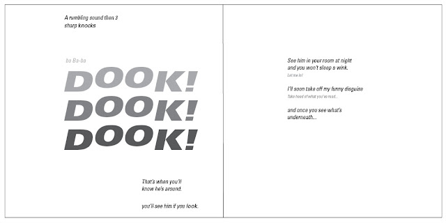
Embedded PDF of Mister Babadook
23/05/18 (Week 9)
 |
| Fig2.14: Printed Book (pg 1) |
 |
| Fig2.15: Printed Book (pg 2-3) |
 |
| Fig2.15: Printed Book (pg 4-5) |
 |
| Fig2.16: Printed Book (pg 6-7) |
 |
| Fig2.17: Printed Book (pg 8) |
_______________________________________________________________
FEEDBACK
08/05/18 (Week 7)
Specific feedback: This week, I got feedback on the previous exercises. For the animated gif of my name (lettering exercise), I was given the feedback that I could look more into details to make the overall outcome better. As for the gif of ‘dead’, (type expression exercise), Mr Vinod said that the letter ‘D’ looked like it was turning instead of falling back, and to improve on it I could use the rotate tool.
15/05/18 (Week 8)
General feedback: We were only supposed to express a maximum of 4 sentences only, which most of us didn’t follow and we expressed most of the words. Therefore we needed to redo it. We were also told to make use of the grids to align our text properly. The spreads should also have some similarities to create a ‘theme’.
Specific feedback: My initial design was not bad, but it didn’t follow the instruction of expressing a maximum of 4 sentences only. Mr Vinod also said that I should be more mindful of the columns and I shouldn’t split a page into half black half white as it is too contrasted.
_______________________________________________________________
22/05/18 (Week 9)
Specific feedback: The final outcome of the hardcopy book was okay, but the pictures I took of the book for my blog had some shadows which didn’t look nice therefore I need to retake them. As for the pictures of the spreads in my blog, I should create a thin black outline in InDesign before exporting it. The lecture notes and further reading were good as it was updated. For the reflection, I was told that I could think deeper about it.
REFLECTION
Experience:08/05/18 (Week 7)
This week, we were introduced to our first project and I got to experience how to use Adobe InDesign which was quite interesting. I got to learn some tools and shortcut keys that will be helpful for the project.
15/05/18 (Week 8)
In this week, the class had to redo the book as it didn't follow the given instructions. It was a good chance for us to correct our mistakes and be more precise with the alignment and other details.
08/05/18 (Week 7)
I noticed that my initial ideas done in class for the story book weren't good so I decided to make changes to it back home.
15/05/18 (Week 8)
I observed that when a text is aligned properly, with the helps of the grids in InDesign, the overall design looks more visually pleasing.
Findings:
08/05/18 (Week 7)
I found that there are actually many ways we could illustrate the script of the story book but it is important to remain some sort of consistency between the pages.
15/05/18 (Week 8)
I realised that by only expressing a maximum of 4 words for the whole book, it makes the book less complicated and overall easy to read.
_______________________________________________________________
FURTHER READING
08/05/18 (Week 7)I Love Futura (I Love Type Series Volume One) Edited & Designed by TwoPoints.Net
 |
| Fig 3.1: Book Cover |
This book illustrates how each type has its own style to it. Typeface doesn’t just play a part in a design by lending an attribute to the identity of something. It also showcases the taste and personality. The type collection series focuses on just one specific typeface at a time and illustrates how it has been used from around the world.
From this book, I got to understand more about Futura and how it’s being used. As of today, Futura continues to be a type that’s used universally and is pretty much available everywhere. Futura is a classic, that has a look that’s simple, with a geometric style that can fit well for different purposes.
 |
| Fig 3.2: Examples of Futura being used #1 |
 |
| Fig 3.2: Examples of Futura being used #2 |
15/05/18 (Week 8)
An A-Z of Type Designers by Neil Macmillan
 |
| Fig3.3: Book Cover |
This book illustrates features by type designers all over the world. The entries are showcased by key typefaces taken from a wide range of sources that includes posters, magazine covers and more. This book comes in handy for typographers, graphic designers as well as students like me as it is informative.
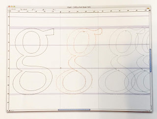
I was drawn to the section of the book that talks about drawing letters and type, initial steps in designing type. It is said that one of the most difficult aspects of designing type is focusing on the idea. A designer named Jeremy Tankard said that he keeps a sketchbook for each designs to make quick drawings and any other references to study. This way, all aspects of designs are given the chance to develop freely. Once the initial ideas are more focused, it is important to look into the details such as the size, weights and widths, the type family and the style. Once he felt comfortable with the notes and designs, then he moved on to the computer. He mentioned that each letters are designed individually but it is important to know that they shouldn’t be treated as individual elements as some letters may not go well in a typeface and it may be seen in isolation. Therefore it is crucial to review the letters in context of the other letters.
I was drawn to the section of the book that talks about drawing letters and type, initial steps in designing type. It is said that one of the most difficult aspects of designing type is focusing on the idea. A designer named Jeremy Tankard said that he keeps a sketchbook for each designs to make quick drawings and any other references to study. This way, all aspects of designs are given the chance to develop freely. Once the initial ideas are more focused, it is important to look into the details such as the size, weights and widths, the type family and the style. Once he felt comfortable with the notes and designs, then he moved on to the computer. He mentioned that each letters are designed individually but it is important to know that they shouldn’t be treated as individual elements as some letters may not go well in a typeface and it may be seen in isolation. Therefore it is crucial to review the letters in context of the other letters.
 |
| Fig3.4: Sketching ideas in sketchbook |
 |
| Fig3.5: Transferring/developing design in FontLab |


Comments
Post a Comment