DESIGN PRINCIPLES - EXERCISES AND PROJECTS

Yeap Phay Min (0331073)
Design Principles
Exercises & Projects
_____________________________________________________________________
Lecture 1: Contrast
28/03/18 (Week 1)
28/03/18 (Week 1)
During our first class of this module, we were given a simple and brief lecture regarding one of the design principles which is contrast. I understood that contrast is a design element in which something is strikingly unlike in comparison - meaning the opposite. For example, dark vs light, thick vs thin, size as well as colours.
Then, we were assigned an exercise in which we were required to create an A4 composition that showcases contrast, and we were free to use any sorts of mediums.
 |
| Initial Idea #2 |
 |
| Initial Idea #1 |
 |
| Progress of final artwork #2 |
 |
| Progress of final artwork #1 |
 |
| Final Outcome: Contrast |
For the first exercise, I decided to use papers as I wanted to do a layered paper kind of art. I went with three colours which were yellow, blue and black because these could show strong contrast since they are complementary colours. I created a composition showing a scene at the beach with waves overflowing out of the circle, as well as a coconut tree and yellow boat for added details. I wanted to show contrast through the blue overflowing waves against the black background, the yellow boat against the blue waves and the silhouette of the coconut tree against the yellow horizon.
Feedback: Ms Sherry commented that my work did show contrast, especially with the colours I went with but it might’ve been stronger if I left out the details such as the boat or the coconut tree, since the overflowing waves were the part I wanted to create contrast and draw attention to.
Lecture 2: Gestalt
03/04/18 (Week 2)
03/04/18 (Week 2)
This week, we got a lecture on a design principle known as gestalt. This is defined as “an organised whole that is perceived as more than the sum of its parts”. From this, I understood that the designs that show gestalt are looked at as a whole image rather than the small details. Without the details, our brains can naturally fill it in for us. We don’t need every single line and detail to figure out what something is in a design that showcases gestalt. Like the previous exercise, we had to create a composition that shows the design principle of the week.
 |
| Experimenting different compositions #1 |
 |
| Experimenting different compositions #2 |
 |
| Experimenting different compositions #3 |
 |
| Final Outcome: Gestalt |
For this exercise, I had chosen to do it digitally using Adobe Illustrator. From the start, I knew I wanted to do it in black and white as I felt that it gives a stronger design that showcases gestalt. As for the design, I created a composition of a camera and hands in a ‘L’ shape as if it’s holding the camera. Inside the camera lens I’ve added a curved lined acting as the reflective part of the lens and it is shaped like a crescent moon therefore I added some stars inside it as well.
Feedback: During the previous tutorial session, I showed Ms Jinchi a simple sketch of my design and she said that it’s successful at showing gestalt as I chose to use an object that is well known, and our brains can easily ‘fill in the gaps’ of the missing details. During the critique session Ms Sherry said that my work showed gestalt and the composition was good as I placed it off centre. She also said that I could consider to create my composition in a landscape mode as it would match the rectangular shape of the camera.
Lecture 3: Symmetry, Asymmetry, Balance, Emphasis
11/04/18 (Week 3)
11/04/18 (Week 3)
It’s presentation day for my group, which meant that we had to give a lecture on the given topics. We talked to the class about symmetry, asymmetry, balance as well as emphasis. In the process of preparing our presentation, I got to understand more about each of the design principles.
Balance: The arrangement of parts that creates a feeling of equilibrium.
Symmetry (Passive): Quality of having parts that match each other.
Asymmetry (Active): Create equal balance among elements that does not exactly mirror each other which creates interesting visuals.
Emphasis: An area of a design that stands out, making it the centre of interest.
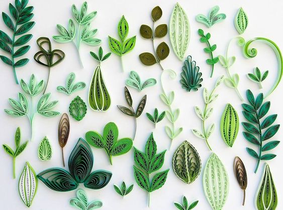
As usual, we had to do an exercise, but this time we got to choose one from the four. I decided to go with the design principle, emphasis.
 |
| Initial Design |
 |
| Inspiration for final idea #1 |
 |
| Inspiration for final idea #2 |
 |
| Inspiration for final idea #3 |
 |
| Final Outcome: Emphasis |
For my design, I decided to create a composition showcasing a shelf of potted plants, with one of them standing out to make it the focal point to show emphasis. To make one of the potted plant stand out, I did paper quilling technique using green and brown coloured paper and it adds a 3D touch to the flat paper. This makes it stand out among the other potted plants that I drew and left without colouring.
Feedback: Ms Sherry said that my design really did show the design principle emphasis, and it was great that I experimented with something different, such as the material and technique used. One of my classmates said that I could’ve lowered the shelf to make it more off centre and I agree. However, Ms Sherry said that the position of the shelf and plants were fine.
Lecture 4: Surface, Texture, Repetition, Pattern
18/04/18 (Week 4)
This week, we got a lecture on the four topics by our classmates.
This week, we got a lecture on the four topics by our classmates.
I understood that:
Surface: Outer/uppermost layer of something
Texture: A surface we can feel, see or imagine (real/actual) (visual/implied)
Repetition: Same/similar elements through a design
Pattern: Repetition of more than one design element
For this exercise I decided to go with pattern, as I found it interesting. Once I knew what design principle I was doing, I started thinking of ideas and I thought of stamping. I had extra lino blocks so I decided to carve two leafs and a hibiscus to create a tropical pattern.
 |
| Inspiration #1 |
 |
| Inspiration #2 |
 |
| Process of carving the lino block |
 |
| Testing out the stamps on a draft paper |
 |
| Third Composition |
 |
| First Composition |
 |
| Second Composition |
 |
| Final Outcome: Pattern |
Feedback: Ms Jinchi saw my composition a day before the critique sessions and commented that it was nice. During the critique session, Ms Sherry said that she liked what I’ve done and she would like the pattern on a dress! She liked the idea of me carving and stamping as it is something different. I had some feedback from my classmates as well. One of them said that the leaves and flowers were all pointing upwards which made it visually pleasing, while the other said that it was good that I left some white space on the paper so it didn’t look fully packed.
Lecture 5: Direction, Alignment, Hierarchy, Placement
25/04/18 (Week 5)
For this week, we learned about four design principles which are important aspects of creating a good design. I understood from the presentation by my classmates that direction leads the eyes to a certain point and there are several types of direction used in a composition such as vertical, horizontal and diagonal. Alignment focuses on how we arrange elements to create a balanced composition. Hierarchy talks about where our eyes will look at first and it ca be achieved through scale, colour and also perspective. Lastly, placement discusses about visual order of elements and it is also a type of contrast that catches our eyes first.
For the exercise, I decided to go with direction. My initial idea to create a composition of a UFO spaceship shooting out a ray of galaxy to show direction from top to bottom. After making rough drafts of the idea, I wasn’t really happy with how it turned out so I decided to think of another idea. My final idea revolved around the idea of a teapot from above pouring out some tea into a teacup. I also decided to use papers, and layered some of them so it didn’t look flat. In the end, I was satisfied with how it turned out!
 |
| Try-out of initial idea #2 |
 |
| Try-out of initial idea #1 |
 |
| Inspiration #3 |
 |
| Inspiration #1 |
 |
| Inspiration #2 |
 |
| Progress: making the teacup and teapot |
 |
| Progress: Assembling all the elements |
 |
| Final Outcome: Direction |
Feedback: Ms Sherry commented that I did a good job with the composition and the usage of papers. She liked how I cut and layered the elements using foam tape which made it ‘pop’ a little from the flat paper. Ms Jinchi also added a comment saying that it was good that I left the background plain and minimal, making the tea thats poured out to stand out. One of my classmate said that I successfully showed direction through the pouring tea and she liked the overall outcome of it.
Lecture 6: Dots & Lines
02/05/18 (Week 6)
This week, we got a lecture on dots and lines. I learned that these are the fundamental elements in a design. Dots are the simplest element of a visual design while lines are a series of points adjacent to each other.
For the exercise, I wanted to do something abstract with the idea of mark making to create lines. I decided to use cutouts of cardboard and a spiral cooking utensil the create 'spiral' looking lines. I finish it off with some small splatters of dots using a toothbrush.
Here are pictures of the materials I used.
 |
| Toothbrush |
 |
| Spring Whisk |
 |
| Cardboard |
 |
| Experimenting with cardboard to create lines |
 |
| First composition: Experimented with coloured background |
 |
| Final Composition: Abstract Lines With Little Splatter of Dots |
Critique session was a little different today. Instead of commenting on every single work, we were given the instruction to write '$25' on 4 pieces of paper and this will act as our cash. We had to walk around the class to have a look at all the artworks created and choose 4 that we would like to 'buy' with our paper cash. From this little activity, my work earned a total of $75.
Lecture 7: Harmony, Movement, Rhythm
16/05/18 (Week 8)
 |
| Inspiration #1 |
 |
| Inspiration #2 |
 |
| Experimenting with different types of florals |
 |
| Final Outcome: Alternating Rhythm - Watercolour Florals |
Feedback: Ms Sherry liked my idea and how my flowers were painted. She commented that my artworks have been pretty nice and delicate. She also said that it was good to try out different mediums as I didn't use watercolour for an exercise yet.
Lecture 8: Shape & Form, Figure & Ground
23/05/18 (Week 9)
From this week's lecture, I understood that shape talks about the external boundary or outline of something, and it is two-dimensional (2D). Shapes can be used to convey moods and emotions, create focal points with different visual weights as well as create movements, textures and depth. The three types of shapes are geometric, organic and abstract. As for form, this talks about something that has volume, hence, a three-dimensional (3D) form. It can used to define space. On the other hand, figure & ground discusses about the relationship between shape and visual perception. The different types include stable, reversible and ambiguous.
For the exercise, I decided to go with shapes, specifically geometric shapes. I wanted to do something abstract and also try to do paper cutout technique. I went with the idea of cutting out triangles randomly and placing it with a layer behind. For the layer, I decided to paint a warm toned watercolour background to go with the brown paper cutouts.
 |
| Progress of cutting out the triangles #1 |
 |
| Progress of cutting out the triangles #2 |
 |
| I also liked how the cutouts created some interesting shadows |
 |
| Process of painting the background layer |
 |
| Final Outcome: Geometric Shapes |
__________________________________________________________
PROJECTS
PROJECTS
Project 1 - Self-Portrait
16/05/18 - 30/05/18 (Week 8 - Week 10)
For our first project, we were required to create a self portrait. The instructions given were that we had to show who we are through the portrait and it doesn't have to be a literal translation of how we look.
To start this project, I started by listing down some words that would describe me and my interests, and I narrowed it down to being crafty, cheerful and happy, as well as a lover of colours, scrapbooking/journaling and positive quotes. As for the medium/materials, I planned to go with mixed media, using materials such as coloured papers and pages from magazines combined with either a photograph of myself, a simple outlined drawing of myself or a simple illustration of myself drawn digitally.
 |
| Listing down some things would show who I am and what I like |
I initially started off by printing a photograph of myself but I didn't really like the way it looked so I decided to go with my other plan which was to create a simple illustration of myself using Adobe Illustrator in which I used the pen tool as well as the eyedropper tool to get the colours to be like the photograph.
 |
| Initial idea: Using printed photographs to collage |
 |
| Process of illustrating a picture of myself in Adobe Illustrator |
 |
| Final outcome of the illustration |
 |
| Printed my illustration! |
Once I got them printed out, I cut them along the little border I created. Then, I traced my silhouette onto a piece of paper and cut it out. After that, I started on the collage by cutting up pages of magazines into triangles and paste them throughout the whole page. I felt like the page needed some colours so I teared up some small strips of washi tape and stick them around the paper. I also decided to place a brown paper behind the cutout of my silhouette made and placed the illustration of myself on top, a little more to the right. I then decided to use my typewriter to type out a positive quote to stick onto my face.
Here are the process pictures!
 |
| Rough sketch of my idea |
 |
| Experimented the background on scrap paper |
 |
| Cut out my silhouette on the paper + started pasting magazine papers |
 |
| Fun part: Adding short strips of colourful washi tapes |
 |
| Typing out quote on typewriter on cream coloured paper |
 |
| The quote I typed out (teared the edges for a scrapbook-ish effect) |
 |
| Final Outcome: Self-Portrait |
Here is the final composition of my self-portrait. Through the background made up from cutouts of magazine, I wanted to portray the crafty side of me as I love to do scrapbooking and journaling. The strips of washi tapes added were used to showcase happiness and fun through its colours. It turned out looking like confetti or sprinkles which are things that show happiness to me as well. Since I'm a lover of quotes and I want to portray how I am someone that's happy and cheerful, I added a quote related to happiness. To sum it up, my self-portrait shows that I am someone that is happy and crafty.
In my final composition, I also applied several design principles. The first principle is contrast in which I decided to create contrast for the background by adding colourful washi tapes on top of the plain black and white magazine cutouts, as well as contrast between the fair skin colour and dark coloured hair and clothing. The other design principle is hierarchy, as the viewer's eyes would look at the quote on my face first, then the illustration of my portrait, and lastly the background. There is also the principle of repetition as I decided to repeat the triangle cutouts and the washi tapes to fill up the whole background. The glossy magazine paper, rough brown paper and the paper ripped along the sides of the quote also gave some texture to the design.
__________________________________________________________
Project 2 - Place
23/05/18 - 6/06/18 (Week 9 - Week 11)
In this second project, we were required to select an area, preferably somewhere around where we stay. It is advised to go to the selected location at different times and observe the place carefully. We should look if there are any elements of design in the place as well as the senses. We are free to use any medium to express the place in an A4 composition.
I started out by listing down places I'm interested in to decide on my final location later on.
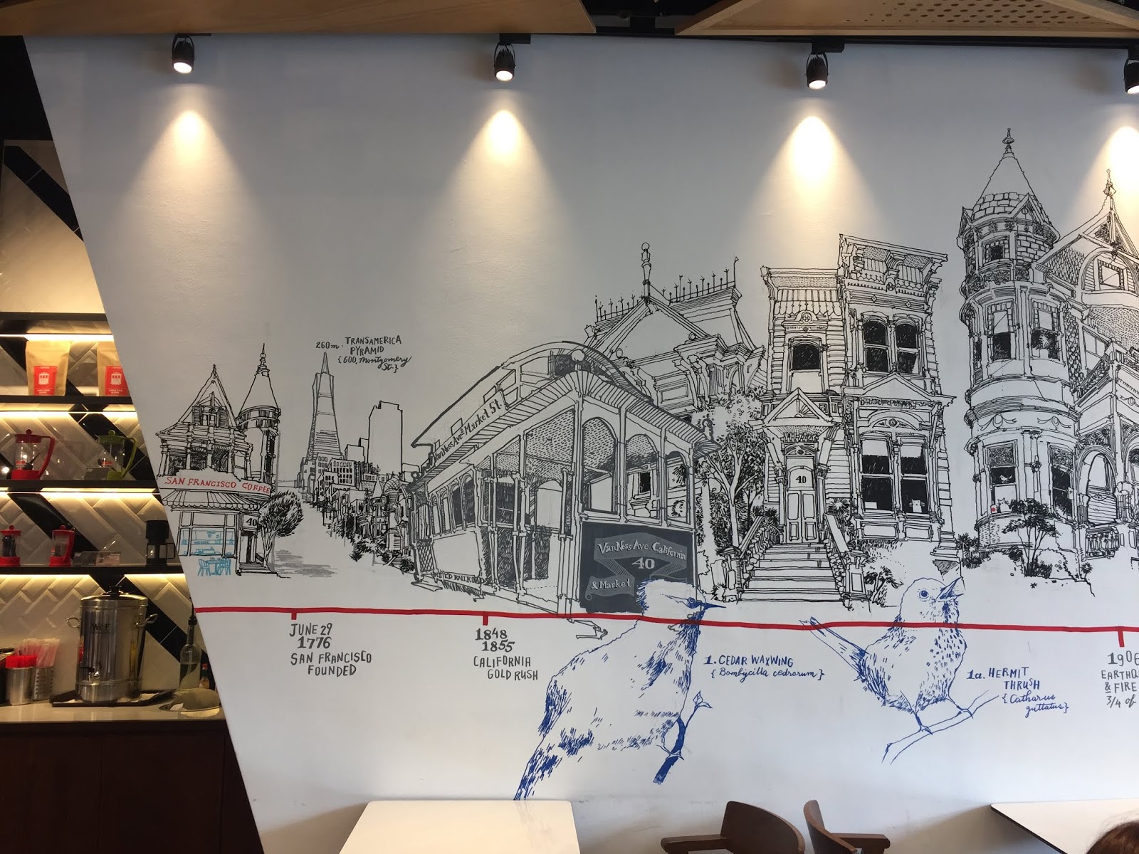
In the end, I decided to go with the location of San Francisco Coffee. The reason for this is because I love drinking iced coffee and I would go out to a coffee shop almost every weekend with my family as a time to catch up after a busy week. I was also drawn to the design of the place as it had really interesting geometric shapes going on for the ceiling and a really cool hand-drawn wall illustration of the city. This brought back the good memories when I was in San Francisco and I have close relatives that live nearby there which made me think of them.
I first went there during the night to observe the place and took some pictures for my references.


Once I had a rough idea on what to do for my composition, I started to create it in Adobe Photoshop with the pictures I've collected. Initially, I used a pic of a coffee stained paper from google images but wasn't really satisfied with how it looked therefore I decided to do it myself by staining some sheets of paper with coffee and crumple it a little for some texture. I plan to scan these stained papers into my laptop as I plan to create this artwork digitally and use these as the base of my composition.
Process pictures of staining paper with coffee:


In my final artwork, I wanted to portray the feeling of warmth because when I think of coffee, I think of being warm and content. To do this, I stayed away from cool tones and used warm tones such as brown from the coffee and red from the logo. Because it is a coffee shop, I decided to use the papers stained with coffee as my base. With the drawings of San Francisco found on the wall of the shop, I decided to include it in the final composition because I wanted to illustrate the sense of wander, nostalgia and sentimental as I was reminded of the times I visited San Francisco and my close relatives that live around the area. I also included the geometric shapes from the ceiling as well as the details on the cup and tissue.
For this project, I made sure I included several design principles in it. The first principle is texture, as I had crumpled the paper before scanning it as I didn't want it to look flat. The next principle is contrast, as there are some pop of reds from the icons that stand out among the brown and black colours. The principle of shape is also applied as I've added the design of the ceiling with triangles into my composition.
__________________________________________________________
Final Project - Billboards
06/06/18 - 27/06/18 (Week 11 - Week 14)
For our final project, we were given the brief to observe billboards we see around us, select two that are advertising something similar and analyse the design principles that are seen in the billboards. Then, we have to create an A3 composition using the design principles as well as some ideas and references from our selected billboards.
I decided to go with the two billboards shown above as they share a similar theme, which is travelling! I picked these two billboards out of all the ones I found mainly because of my love and passion for travelling. My family and I love going on adventures and explore places, within and outside of the country. I always take these family trips as a chance to spend quality time with my family as everyone is usually super busy with work. I'm also highly interested in photography and I enjoy photographing places I'm traveling at.
Once I got my two billboards, I started to look at the design principles it showcases.
Then, with those design principles, I proceeded to do some thumbnail sketches of my ideas. I also decided to stick with the theme of travelling for my composition.
Once I had a clearer idea of what I wanted to create for my composition, I decided to experiment with different ways of illustrating the globe as well as the quote.
Process of the first composition:
Process of second composition:
This time, I decided to use acrylic paint instead of doodling like the previous composition.
Process of final composition:
I liked the way the acrylic painted flowers turned out in the previous but I wasn't satisfied with how the globe's stand and suitcase looked. I also thought that the globe could be bigger to reduce white space. Therefore I decided to repaint it. I also had a rough paper to swatch my colours before painting to make sure it's the colour I want, as well as a paper with the final colour swatches.
After days of painting and painting, here is the final outcome for this final project!
I went with a travel themed composition, with a globe, suitcase, paper airplane as well as a quote. I got the idea of the flowers from the billboard that was advertising Thailand's flower fields. I don't think anyone can be sad when they see flowers. Well, at least for me. Personally, I love flowers and it brings a little spark of joy to me because of how beautiful they are. Whenever I'm travelling, I also always feel a sense of happiness while exploring the place. Hence why I painted flowers on the globe to showcase happiness, because wherever in the world I'm travelling at, I will feel happy. As for the plane, I got the idea from the plane seen in Air Asia's billboard. I decided to go with a paper airplane because I like the origami style it has. The quote used is from one of my favourite movies which is Up! I decided to use this quote as I believe it conveys a powerful message. People nowadays are constantly facing a screen whether it is their phone or laptops but there is so much out there in the world to see and admire its beauty. Therefore I think we should get off our gadgets and step outside as there are truly many wonderful adventures out there.
In my composition, I applied several design principles taken from the two billboards. Firstly, the design principle of contrast. I decided to create contrast between the pink from the background and the turquoise from the globe. The black coloured quote and thread from the sewn paper airplane also creates contrast with the lighter colours background. The next principle is hierarchy and I portrayed this in the design as I made the first word of the quote a lot larger than the other words. There is also the principle of alignment as I made the quote centre aligned. The composition also shows hierarchy in a sense that it guides the viewers eye by looking at the globe first, then the quote. With the paper airplane, it shows the principle of direction and movement because of the lines behind it. The dotted guide lines from the plane also show the principle of lines. Lastly, the flowers in the globe showcases the principle of repetition as I repeated them to fill the whole circle.
__________________________________________________________
Project 2 - Place
23/05/18 - 6/06/18 (Week 9 - Week 11)
In this second project, we were required to select an area, preferably somewhere around where we stay. It is advised to go to the selected location at different times and observe the place carefully. We should look if there are any elements of design in the place as well as the senses. We are free to use any medium to express the place in an A4 composition.
I started out by listing down places I'm interested in to decide on my final location later on.
 |
| Idea of places |
In the end, I decided to go with the location of San Francisco Coffee. The reason for this is because I love drinking iced coffee and I would go out to a coffee shop almost every weekend with my family as a time to catch up after a busy week. I was also drawn to the design of the place as it had really interesting geometric shapes going on for the ceiling and a really cool hand-drawn wall illustration of the city. This brought back the good memories when I was in San Francisco and I have close relatives that live nearby there which made me think of them.
I first went there during the night to observe the place and took some pictures for my references.


I went to the location again during the day to take pictures and also collected the paper cups and tissues that had some cool design as I thought of including them in my collage.


 |
| Things I've collected from the shop |
 |
| Details on the cup |
 |
| Details on the tissue paper |
With all my findings, I did a mind-map to write down what I've observed.
 |
| Mind-map of the reason why I chose the place, the elements of design, the senses and the colour scheme. |
Once I had a rough idea on what to do for my composition, I started to create it in Adobe Photoshop with the pictures I've collected. Initially, I used a pic of a coffee stained paper from google images but wasn't really satisfied with how it looked therefore I decided to do it myself by staining some sheets of paper with coffee and crumple it a little for some texture. I plan to scan these stained papers into my laptop as I plan to create this artwork digitally and use these as the base of my composition.
 |
| Initial Composition |
Process pictures of staining paper with coffee:


 |
| Outcome of my coffee stained paper #1 |
 |
| Outcome of my coffee stained paper #2 |
 |
| Collage of all the pictures I used to create my composition |
 |
| Final Composition of Place: San Francisco Coffee |
For this project, I made sure I included several design principles in it. The first principle is texture, as I had crumpled the paper before scanning it as I didn't want it to look flat. The next principle is contrast, as there are some pop of reds from the icons that stand out among the brown and black colours. The principle of shape is also applied as I've added the design of the ceiling with triangles into my composition.
__________________________________________________________
06/06/18 - 27/06/18 (Week 11 - Week 14)
For our final project, we were given the brief to observe billboards we see around us, select two that are advertising something similar and analyse the design principles that are seen in the billboards. Then, we have to create an A3 composition using the design principles as well as some ideas and references from our selected billboards.
 |
| Selected Billboard #1 |
 |
| Selected Billboard #2 |
I decided to go with the two billboards shown above as they share a similar theme, which is travelling! I picked these two billboards out of all the ones I found mainly because of my love and passion for travelling. My family and I love going on adventures and explore places, within and outside of the country. I always take these family trips as a chance to spend quality time with my family as everyone is usually super busy with work. I'm also highly interested in photography and I enjoy photographing places I'm traveling at.
Once I got my two billboards, I started to look at the design principles it showcases.
 |
| Analysing the design principles from the two billboards |
 |
| Rough thumbnail sketches |
 |
| Rough sketch of final idea |
 |
| Final sketch |
Once I had a clearer idea of what I wanted to create for my composition, I decided to experiment with different ways of illustrating the globe as well as the quote.
 |
| Trying out ways to write the quote with different mediums |
 |
| Experimenting with watercolour |
Process of the first composition:
 |
| Drawing flowers on the globe |
 |
| Trying to arrange the paper flowers |
 |
| Sewing the paper airplane |
 |
| Cutting out the paper onto a yellow painted background with embroidered paper airplane |
 |
| Cutting the leaves |
 |
| Outcome of Initial Composition |
Process of second composition:
This time, I decided to use acrylic paint instead of doodling like the previous composition.
 |
| Process of painting the flowers #1 |
 |
| Process of painting the flowers #2 |
 |
| Outcome of the flowers |
 |
| Painting the globe |
 |
| Outcome of the globe |
I liked the way the acrylic painted flowers turned out in the previous but I wasn't satisfied with how the globe's stand and suitcase looked. I also thought that the globe could be bigger to reduce white space. Therefore I decided to repaint it. I also had a rough paper to swatch my colours before painting to make sure it's the colour I want, as well as a paper with the final colour swatches.
 |
| Rough paper with colour swatches |
 |
| Final colour swatches |
 |
| Painting the background pink! |
 |
| Completed the painting of the background |
 |
| Painting the globe |
 |
| Completed the painting of the globe |
 |
| Completed the painting of the globe's grey stand |
 |
| Painting the travel suitcase |
 |
| Painting the flowers |
 |
| Adding details to the flowers |
 |
| Painting more flowers |
 |
| Adding leaves with gold paint |
 |
| Final outcome of the flowers |
 |
| Outcome of the background, globe and suitcase |
 |
| Writing the quote |
 |
| Sewing the paper airplane |
 |
| Completed paper airplane |
 |
| Love how the gold paint made it look 'sparkly' when I move it |
 |
| Final Composition |
After days of painting and painting, here is the final outcome for this final project!
I went with a travel themed composition, with a globe, suitcase, paper airplane as well as a quote. I got the idea of the flowers from the billboard that was advertising Thailand's flower fields. I don't think anyone can be sad when they see flowers. Well, at least for me. Personally, I love flowers and it brings a little spark of joy to me because of how beautiful they are. Whenever I'm travelling, I also always feel a sense of happiness while exploring the place. Hence why I painted flowers on the globe to showcase happiness, because wherever in the world I'm travelling at, I will feel happy. As for the plane, I got the idea from the plane seen in Air Asia's billboard. I decided to go with a paper airplane because I like the origami style it has. The quote used is from one of my favourite movies which is Up! I decided to use this quote as I believe it conveys a powerful message. People nowadays are constantly facing a screen whether it is their phone or laptops but there is so much out there in the world to see and admire its beauty. Therefore I think we should get off our gadgets and step outside as there are truly many wonderful adventures out there.
In my composition, I applied several design principles taken from the two billboards. Firstly, the design principle of contrast. I decided to create contrast between the pink from the background and the turquoise from the globe. The black coloured quote and thread from the sewn paper airplane also creates contrast with the lighter colours background. The next principle is hierarchy and I portrayed this in the design as I made the first word of the quote a lot larger than the other words. There is also the principle of alignment as I made the quote centre aligned. The composition also shows hierarchy in a sense that it guides the viewers eye by looking at the globe first, then the quote. With the paper airplane, it shows the principle of direction and movement because of the lines behind it. The dotted guide lines from the plane also show the principle of lines. Lastly, the flowers in the globe showcases the principle of repetition as I repeated them to fill the whole circle.

Comments
Post a Comment